Introduction
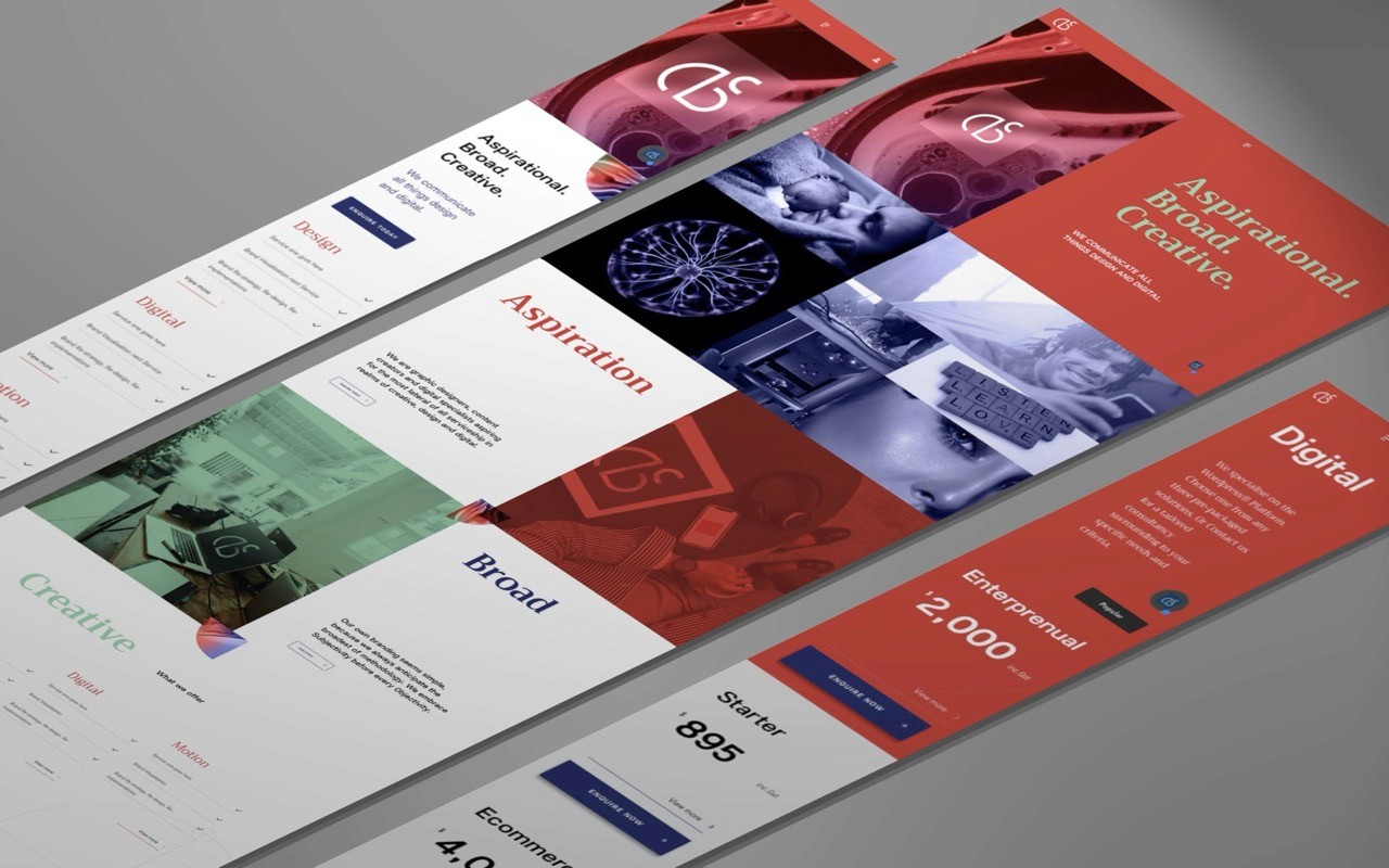
Originally a 2019 Branding & Website Revisualization, ABC Creative began as a solo-preneur creative led by Andrew Beckham specialising in Wordpress® design and development solutions; comprising of three-person start-up model . In 2019, a "scale-up" business decision was made to accommodate projects of increased scope(s), but within cost conscious market of B2Bs. As contracted freelancer, I was tasked to re-visualize the front facing website as well as writing a full style guide to facilitate the brand's future custody. * Here in this NDA Recreation and fictionalised names including this identity were resorted for confidentiality. However all processes remain authentically re-created.
Problem Statement
A three-person start-up requested a website visualization to modernise existing business propositions; alongside a branding style guide to help pave onwards future brand custody for consistency maintenance.
Originally an Adobe XD® project as it was factually conducted.

AI / Automation Use Clause
Here in this updated NDA Recreation, a sample user persona was generated to honour the research phase at identifying the ideal customer demographic - requiring cost conscious but bespoke client experience serviceship as digital solutions provider; predominantly within the Wordpress® Platform.
Solution
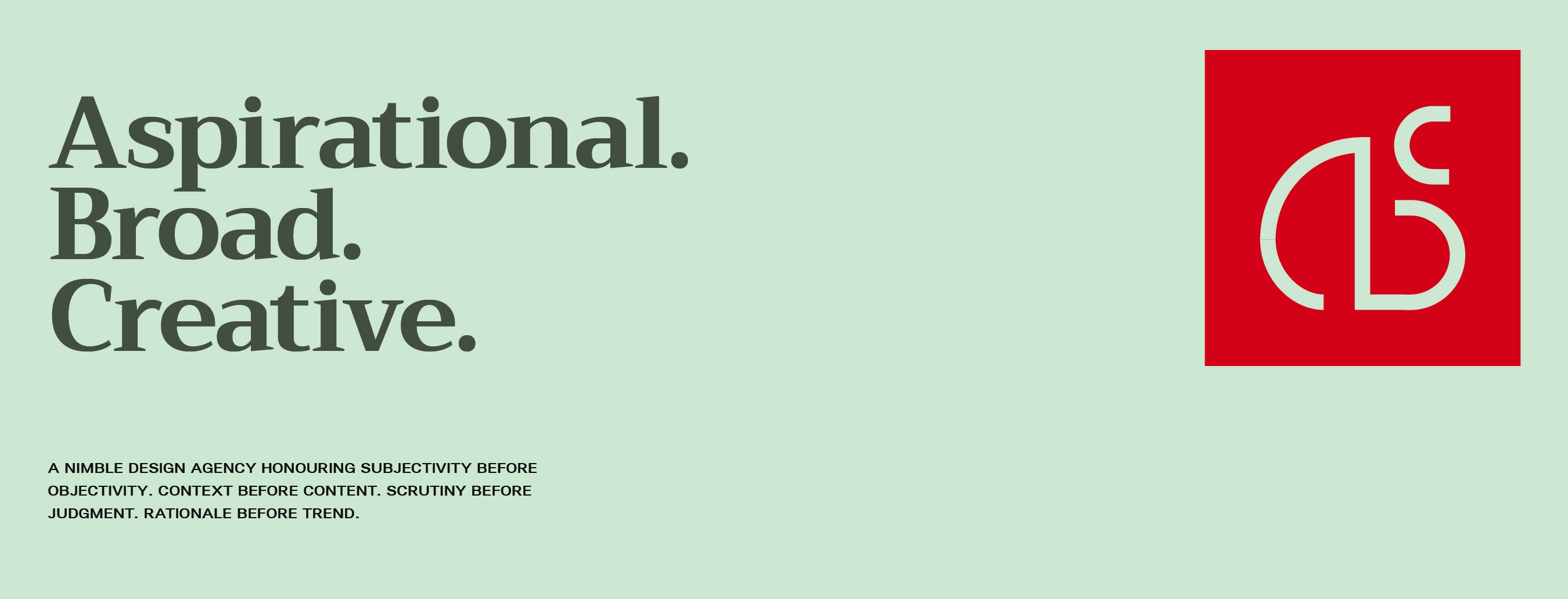
The company name (for this NDA Recreation) was proposed as "ABC" Creative to convey approachability for the cost-conscious, retail market B2B scopes. As well - to honour the three (3) core personification behind the agency's vision - to be fully Aspirational, Broad in ambitions and of all ~ Creative.
Demographic Details
ABC Creative caters both small to medium / retail size businesses. The team prides on nimble, close-knit yet agile in operational structure.
Sample Persona
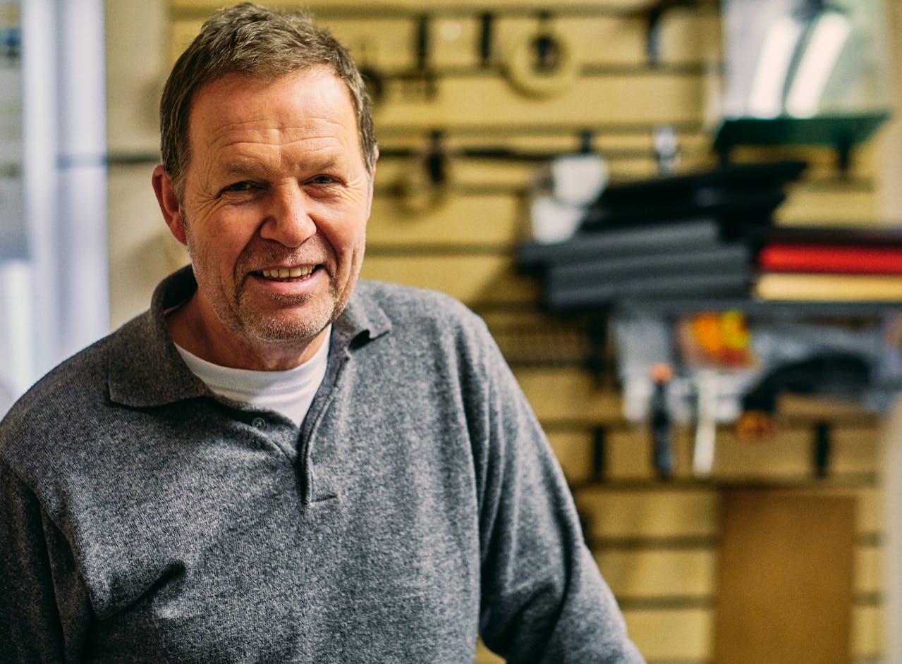
Mr Robert Miller
48 years
Perth, Western Australia
Role: Operations Manager / Co-Owner "Miller & Sons Hardware" (Regional 3-store chain)
Introvert
Extrovert
Analytical
Creative
Busy
Time Rich
Messy
Organized
Independent
Team Player
Safe
Risky
Background
Rob is a second-generation owner who grew up in his father’s hardware business "Miller & Sons Hardware".
He spent his teens loading lumber and his 20s learning inventory management. By 2021, he has transitioned the business from a single "mom-and-pop" shop to a regional three-store chain.
Education: Unlike his father, Rob holds a Bachelor of Business Administration (Class of 2000). While he respects tradition, his degree gave him the foundational "big picture" mindset needed to manage regional logistics.
Career Path: Before taking over the family business, he worked for five years as a junior operations coordinator at a larger industrial supplier. This gave him a distaste for "corporate bloat" and impersonal service, which now defines his own business values.
Recently upon witnessing relative competition of visual and styling prowess, made Rob reconsider his existing website for a visual as well as (for future / next scope third party advisory) content writing ~ face lift.
He valued the ABC Creative three-person structure because it mirrors his own small-business values: accountability, agility, and a "get it done" attitude. The conservative, friendly service style likewise puts him at ease, making him feel like a partner rather than just another ticket number to a large, "full service" house digital design firm.
Industry & Interests
Needs & Goals
Motivations
Pain Points & Frustrations
Styling & Artifacting Inspirations
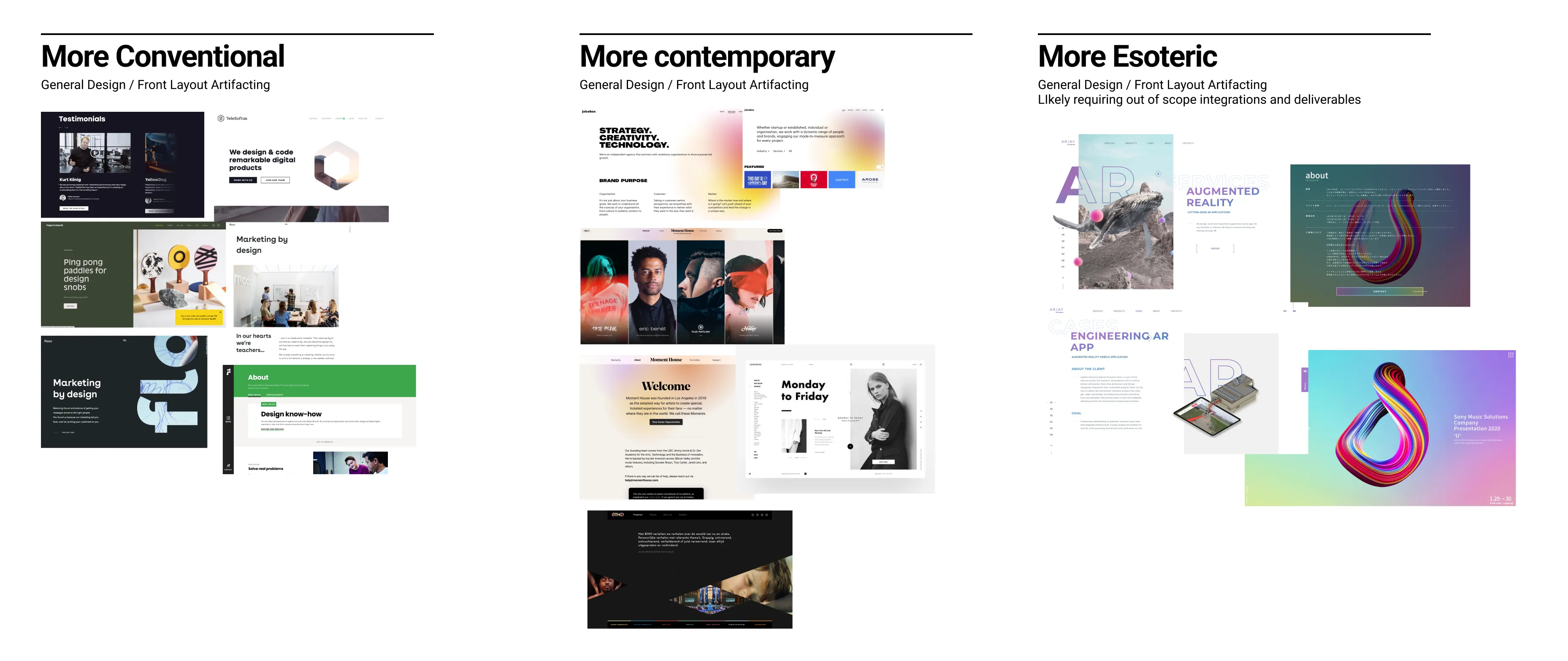
As a "creative" agency in spirit, I firstly explored various aesthetic artifacting & graphical storytelling commonly anticipated amidst consultancy spheres. These peers including trends of web design technologies at the time were curated to stratify levels of visual and tech development prestige ~ ranging from conventional to esoteric.
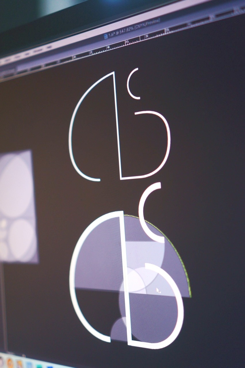
The Branding Design
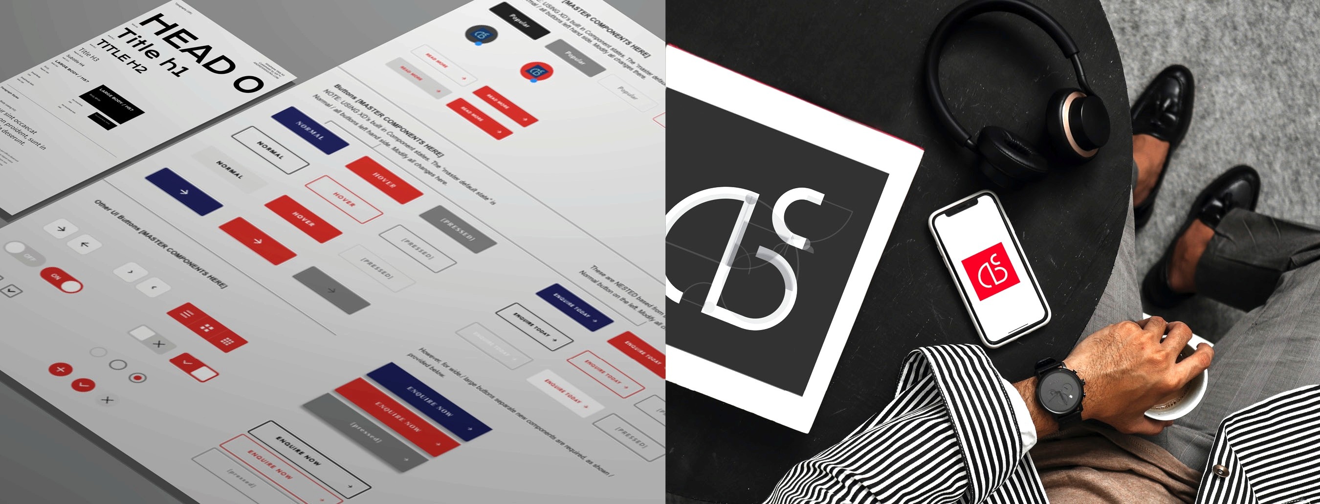
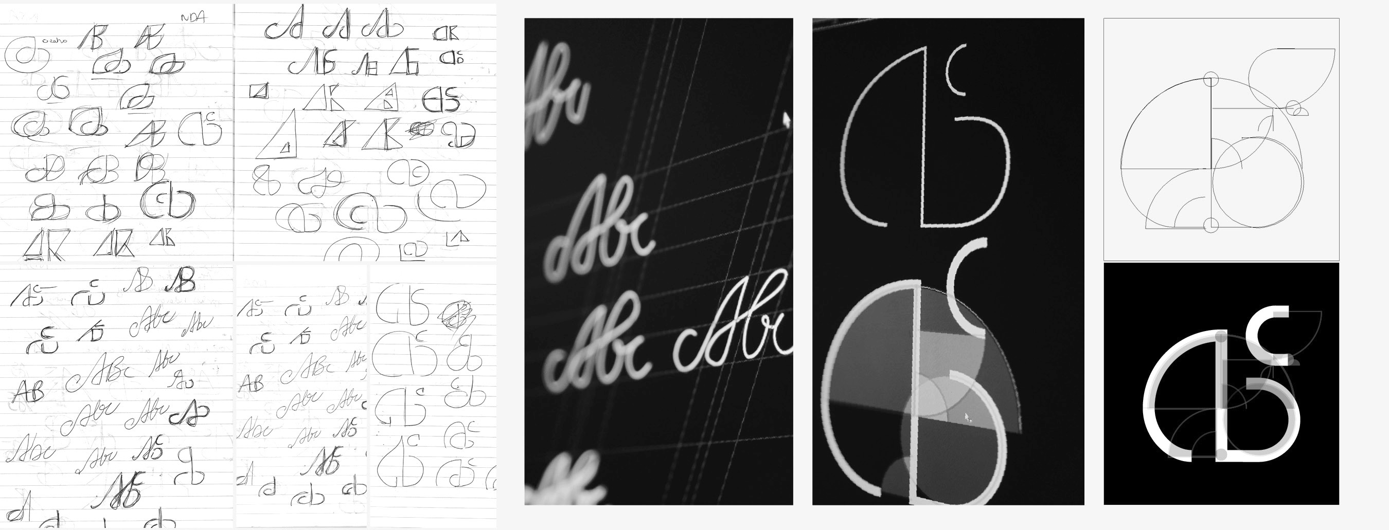
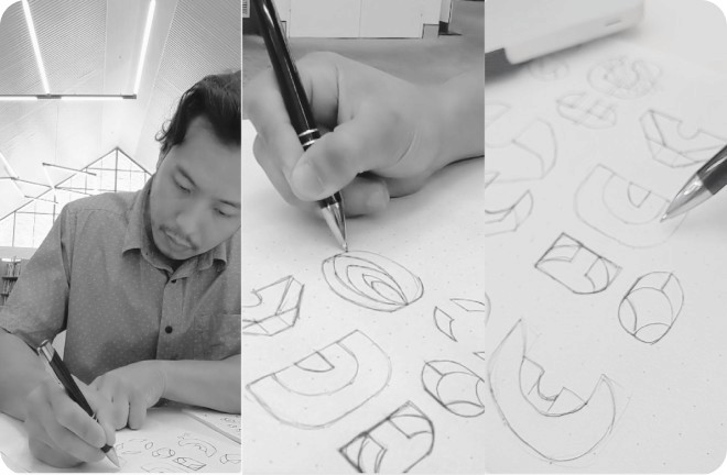
Paying homage to basic curvatures to depict the letterform(s) A, B and C. Here various sketches and drawings were shown first as their drawn beginnings, before then manually re-translated / refined in vector forms.
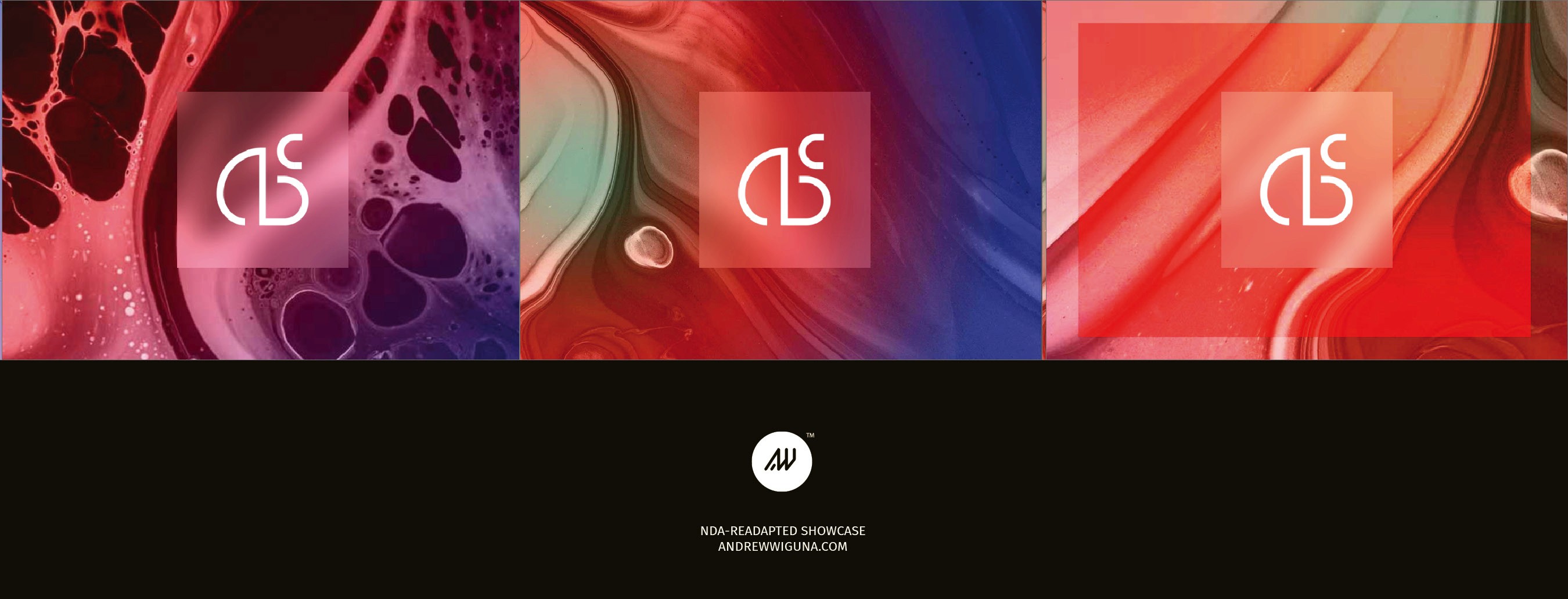
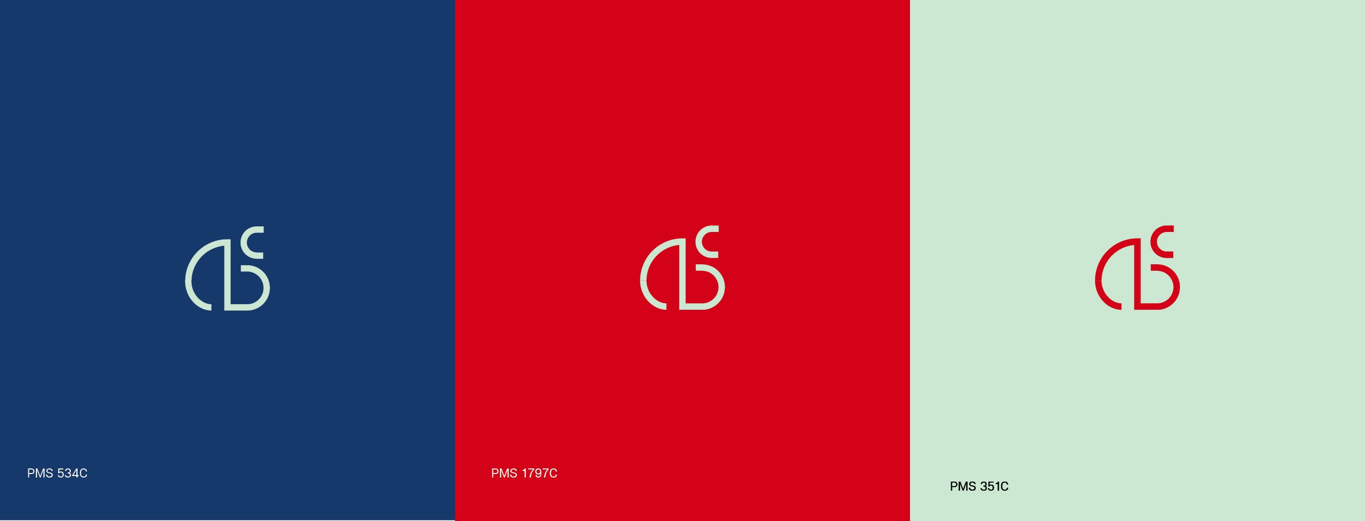
To convey confidence yet reserved in overall stance, three main colours reds blues, and a muted green (for sporadic accents) were proposed.
The Web Design
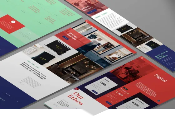
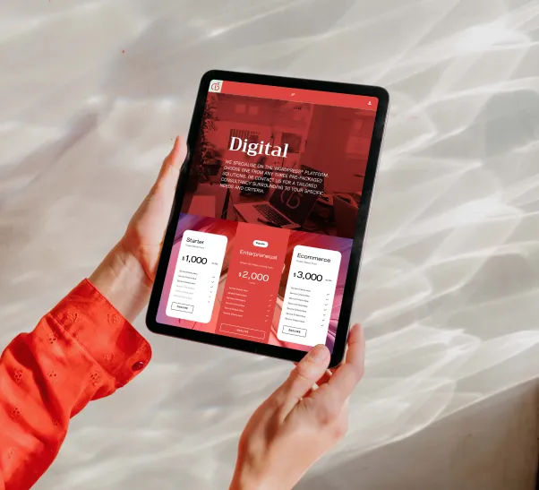
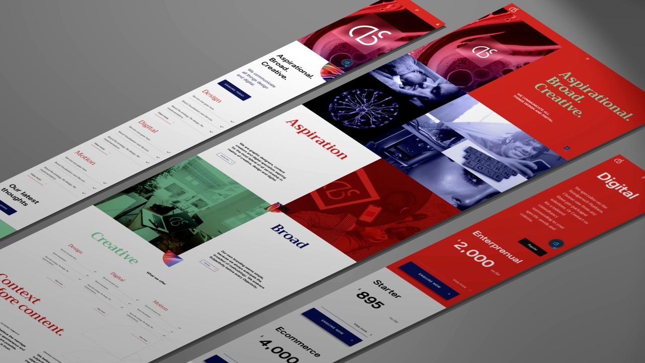
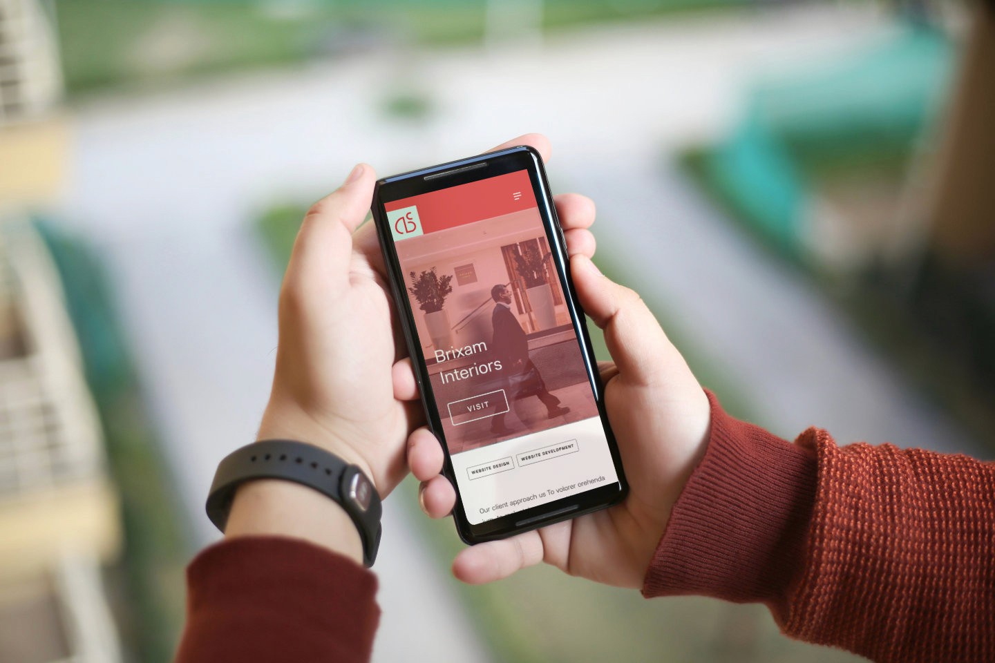
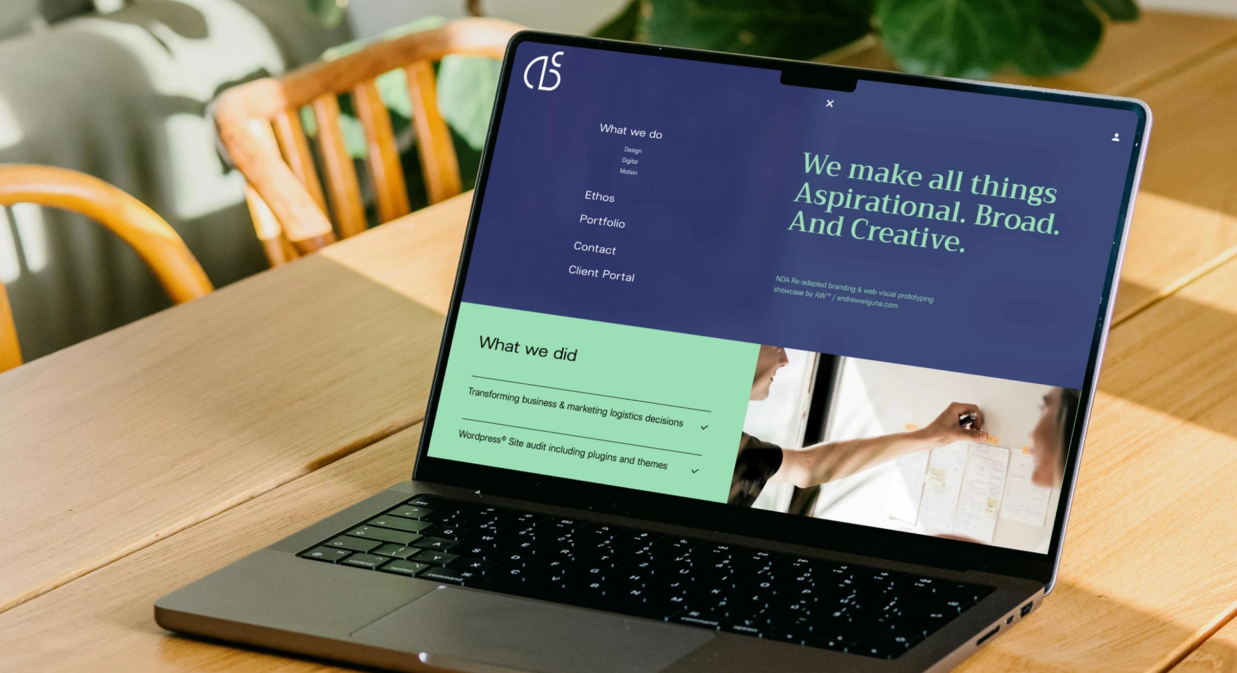
Showcased here are the high fidelity funnel site design/s. Taking cues during the research phase - here the best of balance between conventional and the more esoteric peers' were portrayed in best-balance proposition here; in spirit to the agency's message to remain aspirational, broad in its capability, and creative in its vision and mission as a trusted Wordpress® digital solutions provider.

SWIPE
The Style Guide
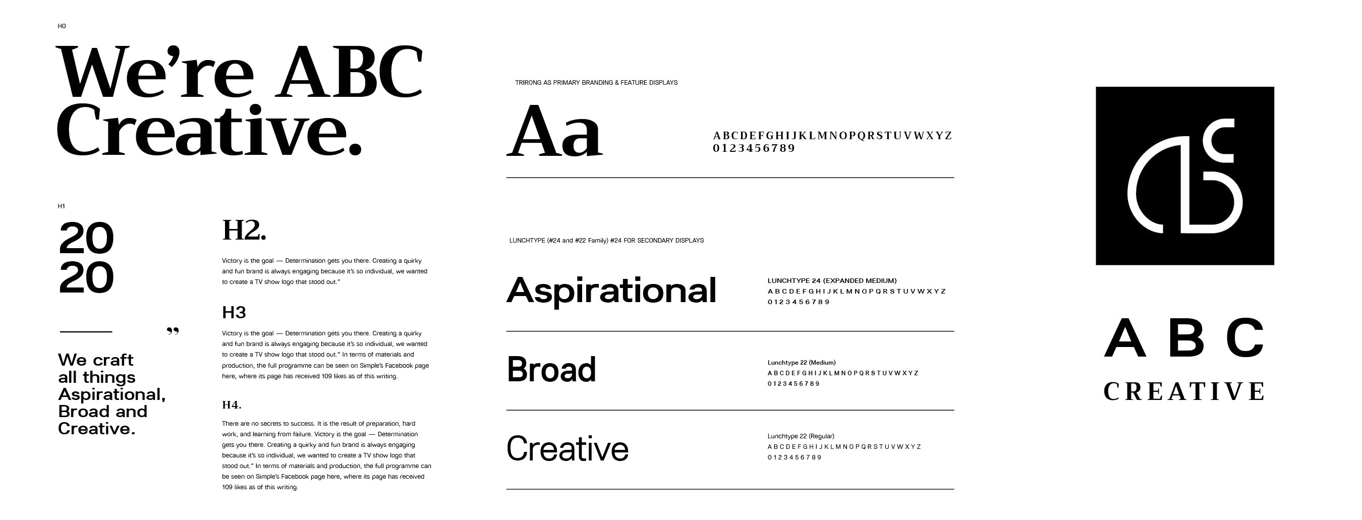
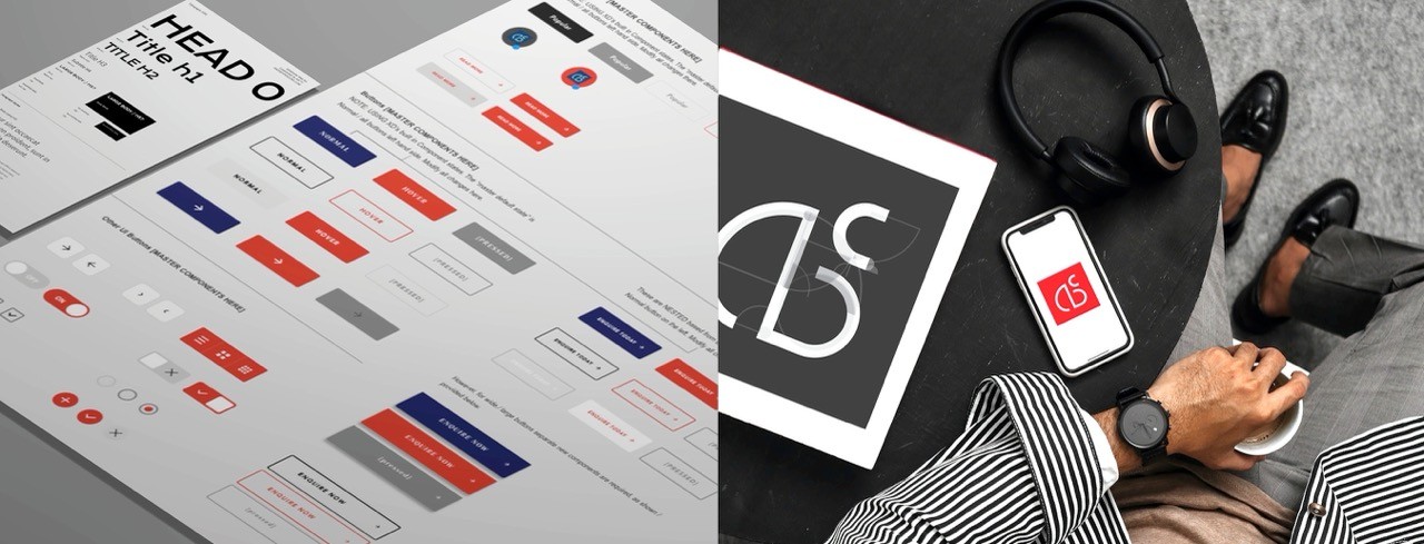
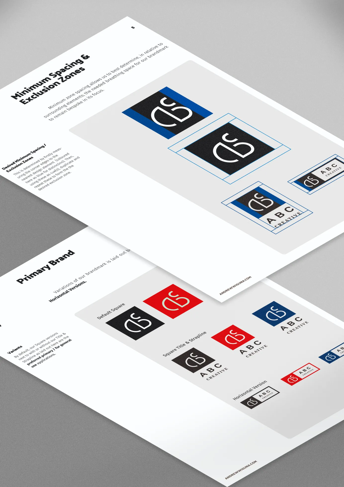
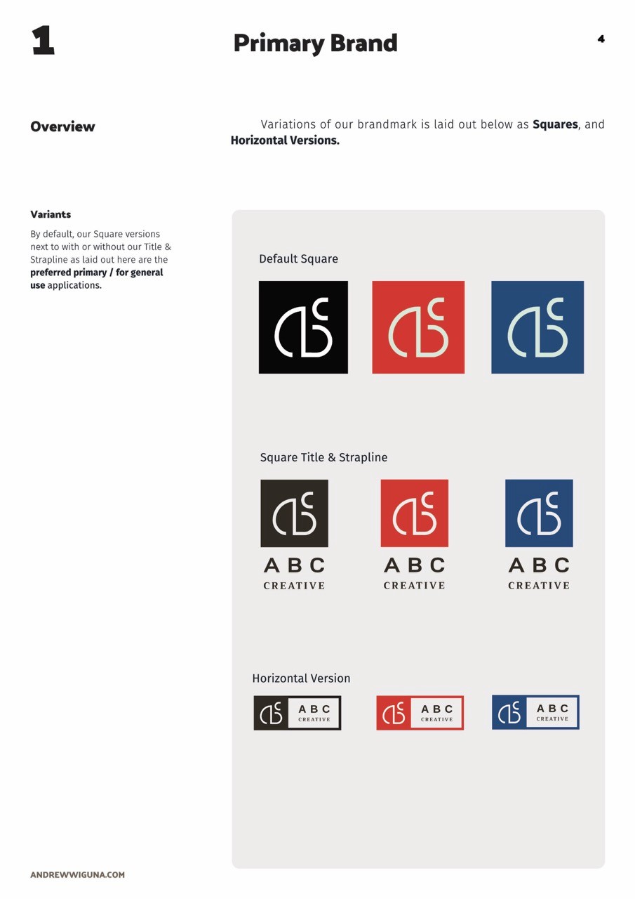
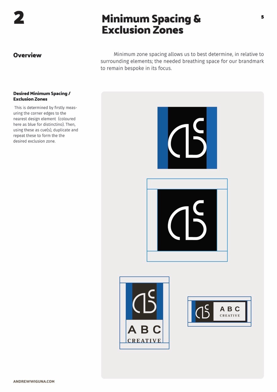
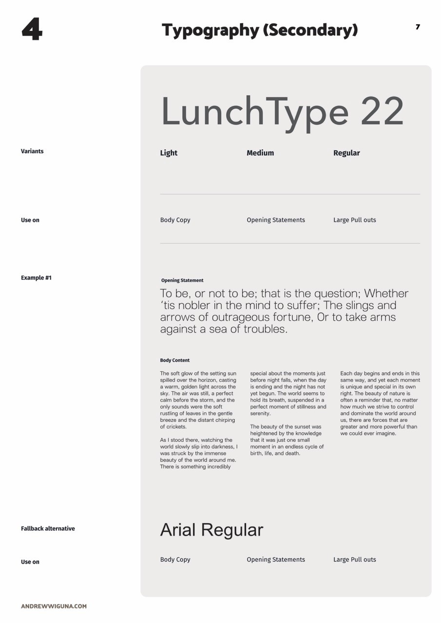
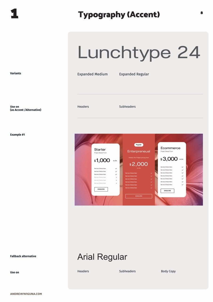
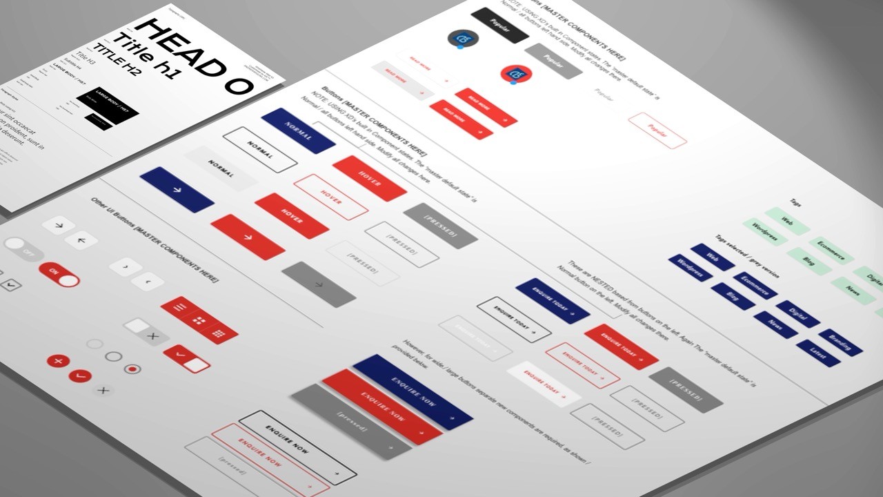
Upon satisfactorily approval, a 28 page Style Guide writing and tailoring then follows; detailing the brand design laws , guidelines and example use cases. Due to strict NDA, only a few re-created sampling of the layouts are provided here only for succinct demonstration.

SWIPE
SWIPE
About this Case Study
Unless otherwise explicitly specified - all artworks, including naming, titling, sample content-writing including this Case study, and the entire front-end development ~ have NOT been entirely resorted through Artificial Intelligence, generative tools or LLM-assisted prompting models.
All hours expended on each project was conducted out of limited, personal and voluntary capacity on top of / during full time tenure.