Introduction
A (re)brand for renewable energy producer accross three energy products (Water, Wind and Hydrogen).
Deliverables as follows:
As part of this NDA -Recreation - entire naming + title research,
The branding design processes, from concepts to PGD/Preliminary Guided Decision.
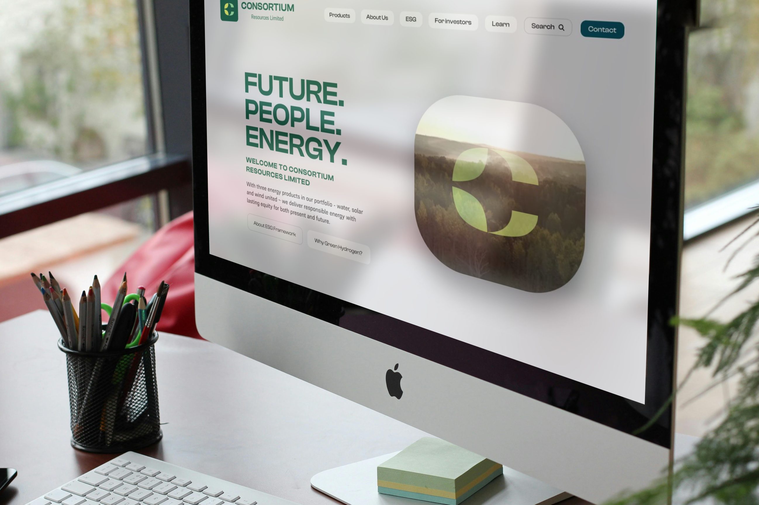
In Part Two - the web design and front-end trial development showcase in Framer®.
Includes preliminary but limited IP / intellectual property courtesy searches. Naming and titling here were re-created anew to maintain NDA anonymity.
Problem Statement
An established resources company sought full re-branding identity and (as detailed in Part 2) website visual to promote untapped reservoire of renewable resources within specific region of Western Australia. Allegiance to the ESG (environmental, sustainability, governance) framework to meet emerging compliance towards "Net Zero", was expected among the company's chief propositions.
Solution
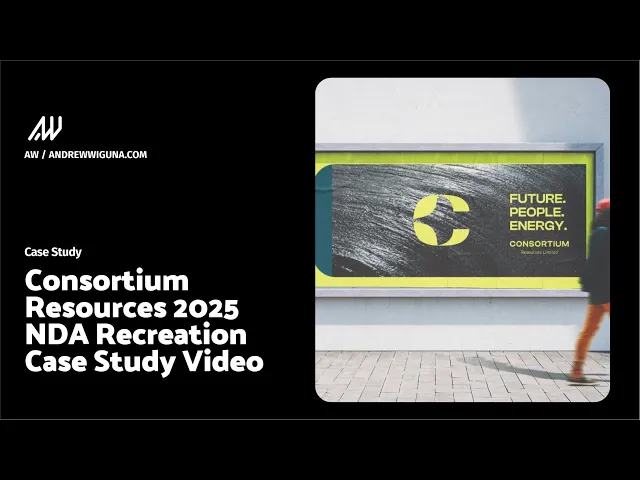
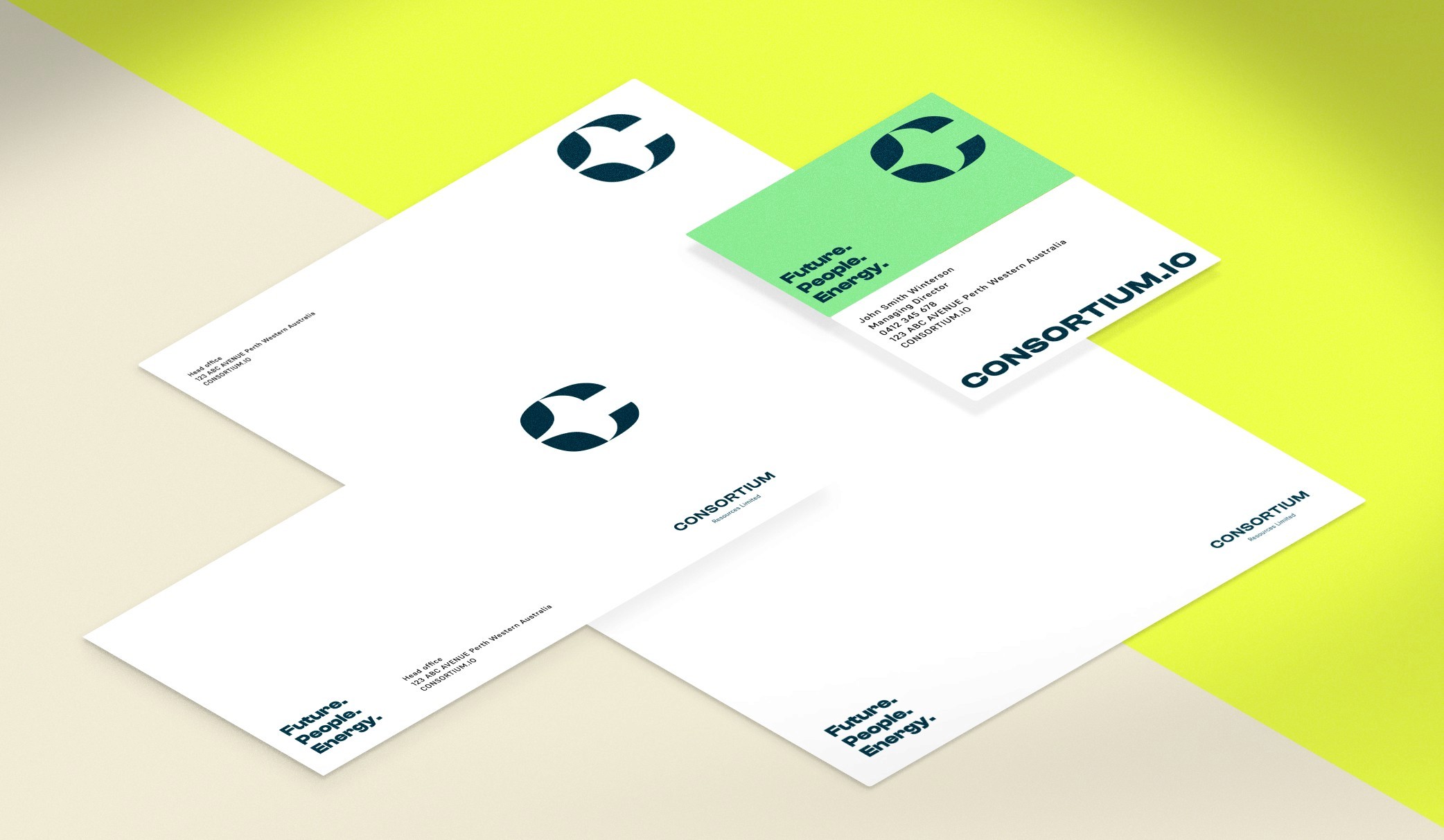
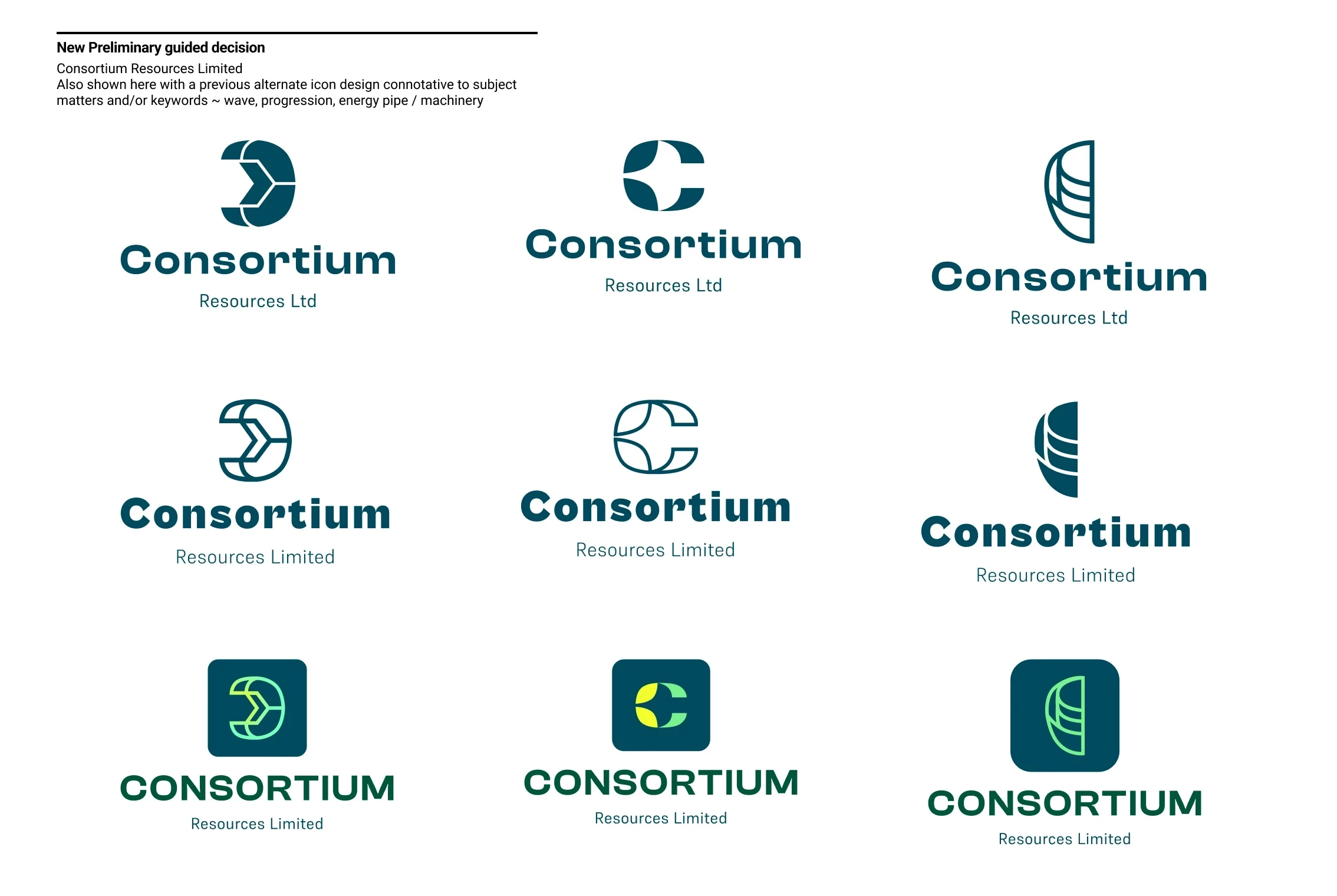
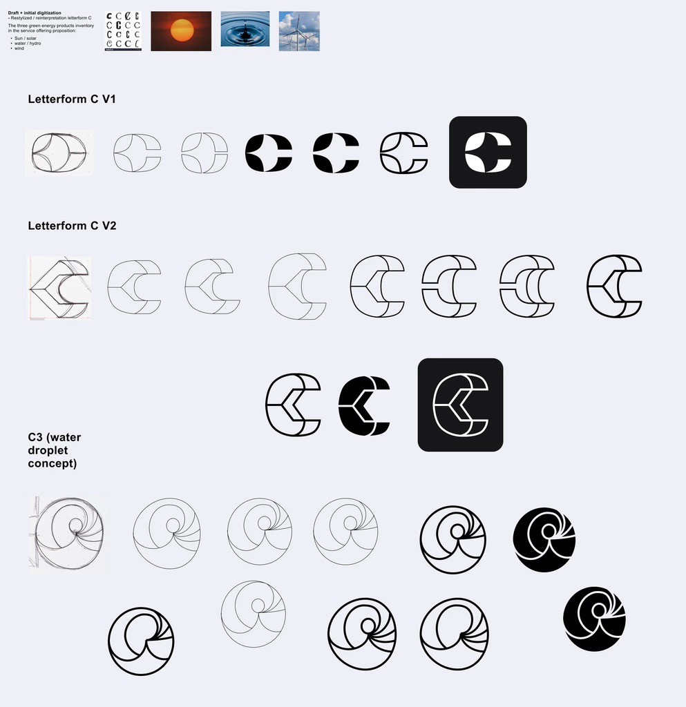
To reflect environmental governance ~ "Consortium Resources" was proposed as the company title, with brandmark coinciding the letterform "C". A specific turquoise, lime and aquamarine combines together as primary palette to express security and environmentalism. (And in part 2) ~ high fidelity web visualization and front-end partial build in Framer® demonstrates ease of content management with macro animations and automatic dark mode. Fully narrated and edited Video Case Study is provided below.
Demographics
Investors on the energy sector, particularly emerging markets on the renewable energy (solar, wind, and green hydrogen).
30-55 years of age.
Relatively higher income presuming existing familiarity surrounding finance / fin-etch and investing.





SWIPE

Sundar Kamar Singh
Archetype ~ “The Investor”
42 years
Perth, Western Australia
Senior Engineering Consultant / investment enthusiast amongst future derivatives and various cryptocurrency initiative(s).
Introvert
Extrovert
Analytical
Creative
Busy
Time Rich
Messy
Organized
Independent
Team Player
Safe
Risky
Background
Sundar came from a humble, working class family from Pakistan. Emigrated to India at the age of ten, he obtained his bachelor and then honours ¬ on Engineering and Sociology. Sundar accumulated his expertise and passion in engineering. From the ground up - he worked as a consultant on smaller to then gradually large and various key national infrastructure projects.
In 2010, Sundar made the move to the sunny side of Queensland, Adelaide where he pursued, on top of engineering ~ personal interests surrounding investing and wealth building.
Today, Sundar works as a chief consultant for a prolific mining firm. However, at his spare time he frequent various blogs, and social media channels on emerging financial interests ranging from cryptocurrency, fintech, and enviro-blockchain projects particularly from Australia then globally abroad.
Sundar is renowned by his peers to be down-to-earth amidst all stakeholder interactions. Calculated and skeptical to anything new or novel, he is reserved to not express opinions . Wherever away from the digital screens, he is occupied with his beloved family of three children and golden retriever.
Industry & Interests
Needs & Goals
Motivations
Pain Points & Frustrations
(Initial) Naming Research & Shortlist
Both abstract and mythical inspirations were considered including compounding words (eg. “Fed Ex and Microsoft”). Two potential ideas were shortlisted:
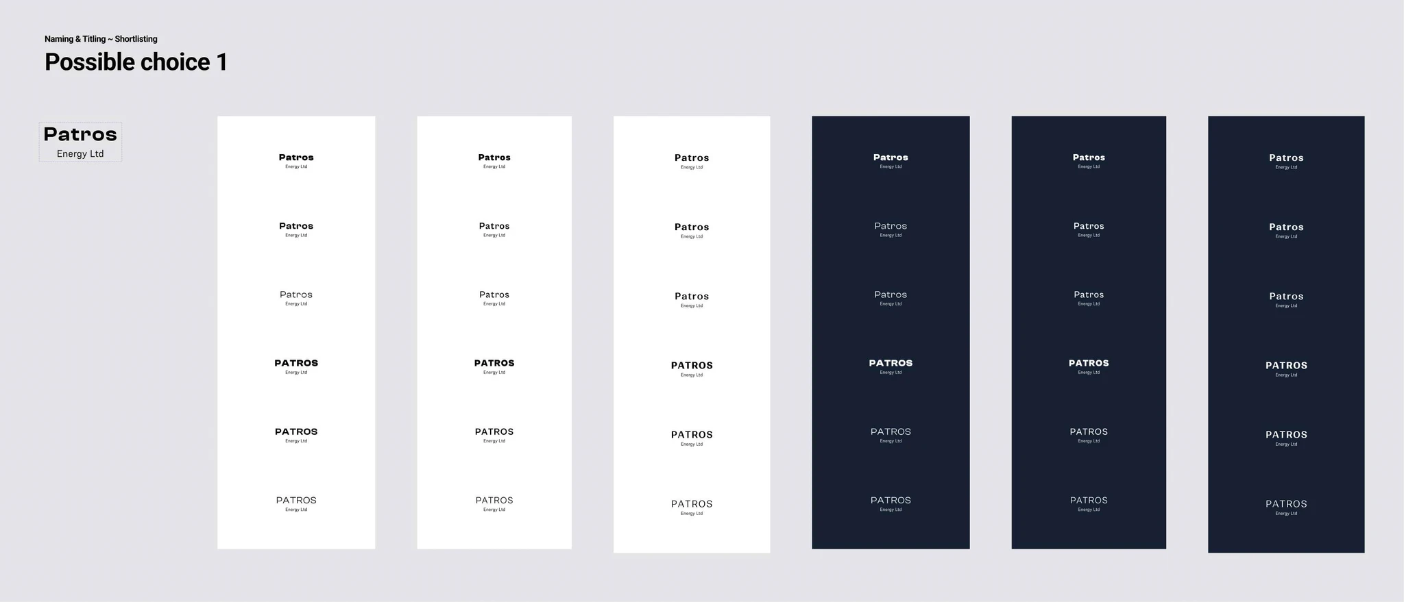
"Patros | Energy Institute"
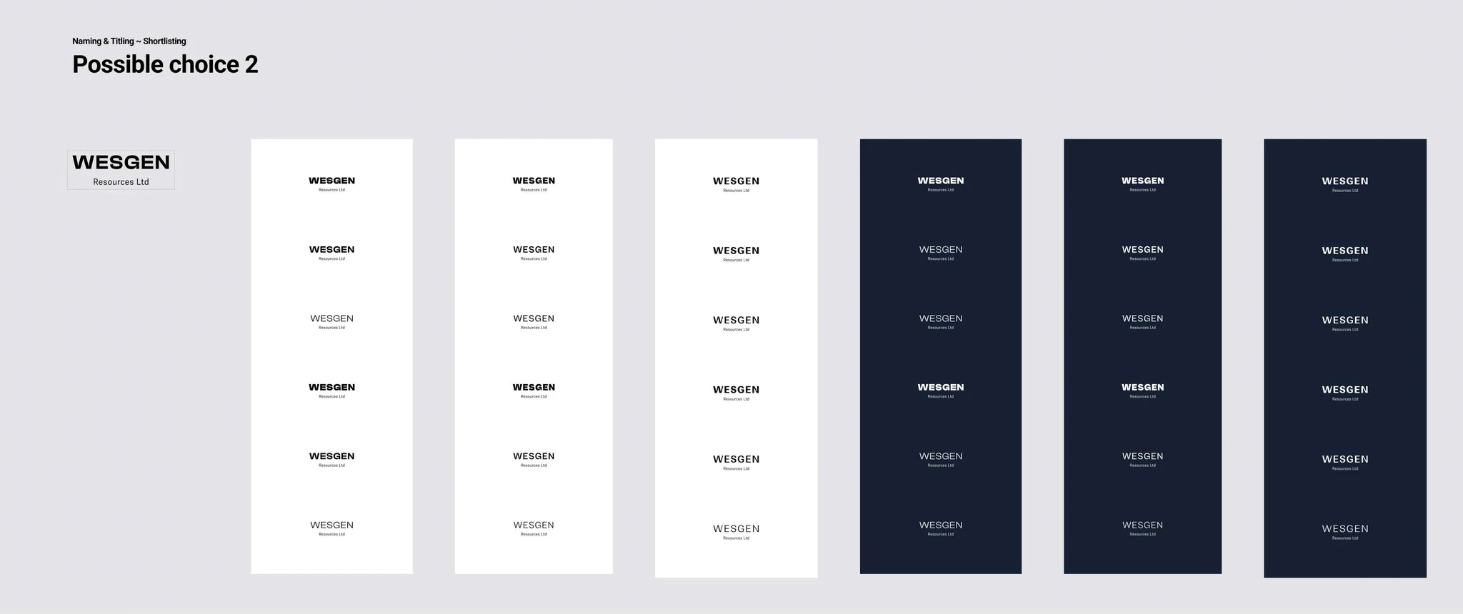
Patros ~ deriving from the Greek word “Father”, personifying stewardship and pledge towards sustainability and governance."Wesgen | Resources Limited"
Wesgen ~ consisting of two (2) parts. “West” to indicate Western Australia as the company’s enterprenual beginnings. Followed by “Gen” to indicate genesis as an indirect referencing off divine creationism.
"Wesgen" ~ was proposed as the first guided recommendation.
However an unexpected match within a second intelelctual property search revealed a somewhat similar titling. Hence a reconsideration took place soon after.
(Second) Naming Concepts considerations
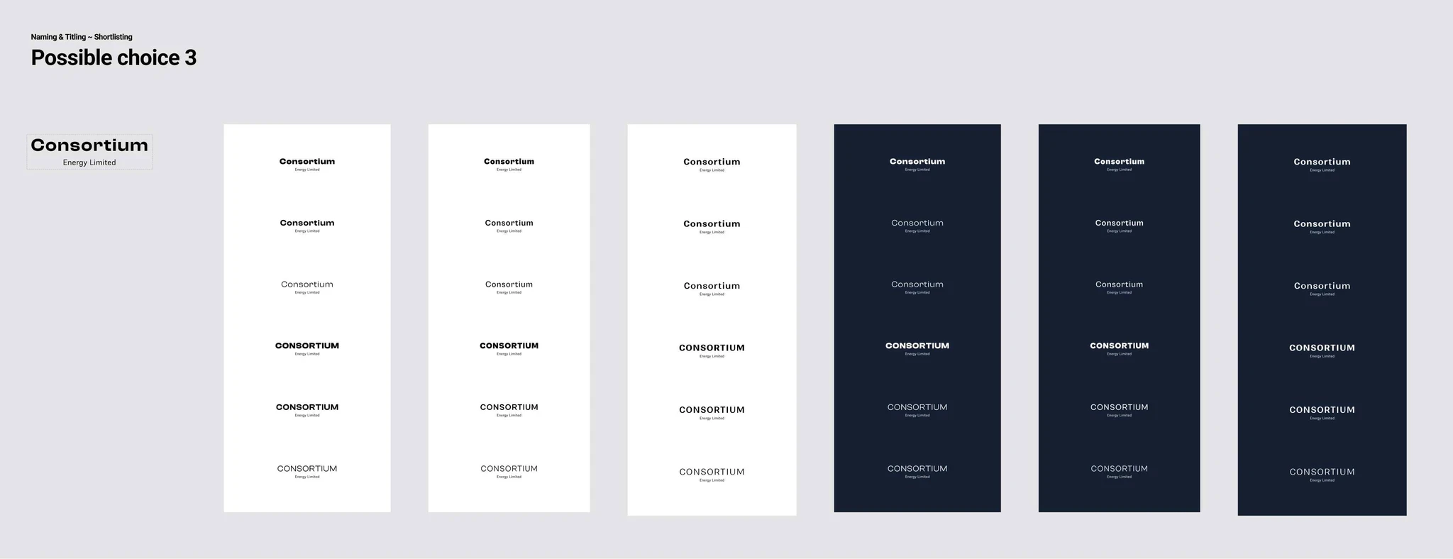
Wesgen to Consortium
Upon further IP / intellectual property courtesy search, a number of similar though not 1:1 exact coincidentals were found. Thus necessitating new concept namings as follows:
"Consortium" / Energy / Resources Limited
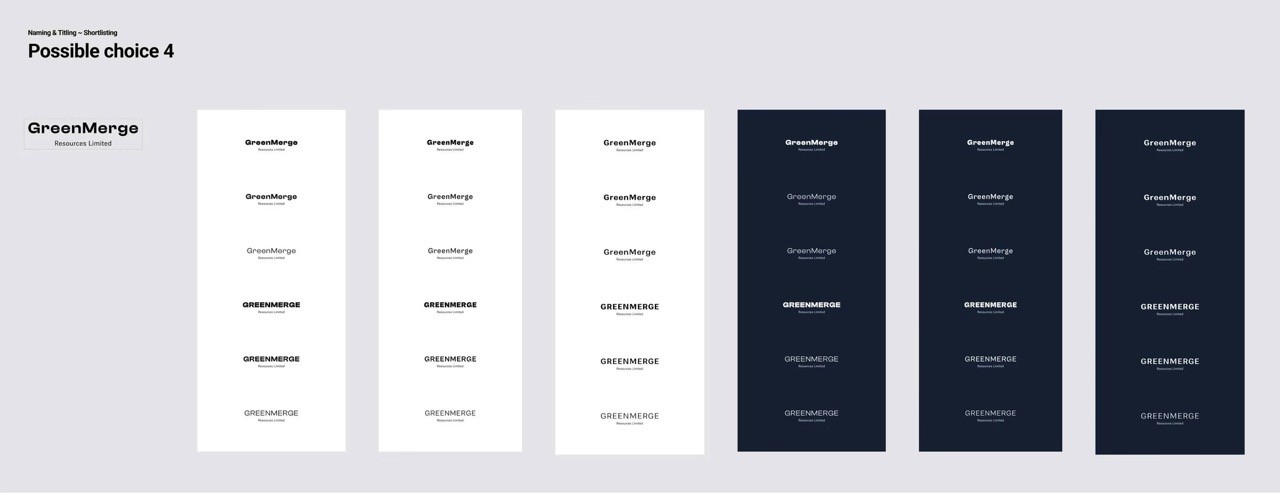
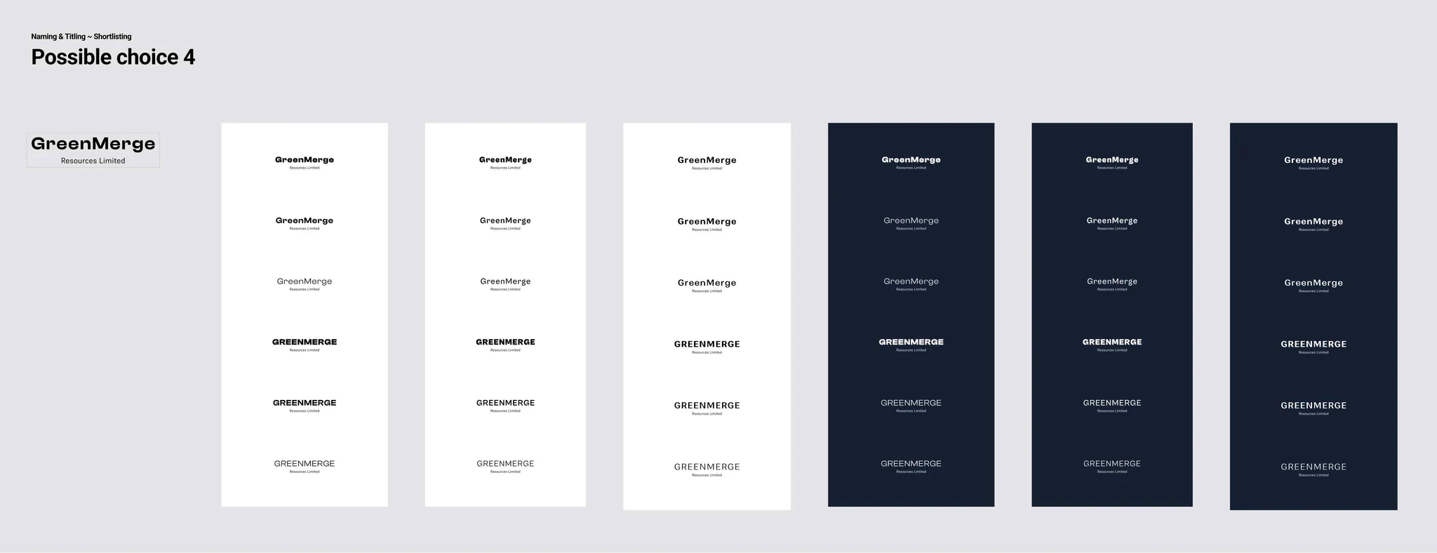
Consortium - referring to cooperation and allegiance."Greenmerge" / Energy / Resources Limited.
Greenmerge ~ a compound title consisting of green and merge to signify converging harmony towards renewable and conscious energy solution.
Of the two, Consortium Energy / Resources Limited was proposed for its conservative metaphor(s) inbetween governance, thought-leadership and trust.
Moodboarding to Stylescape
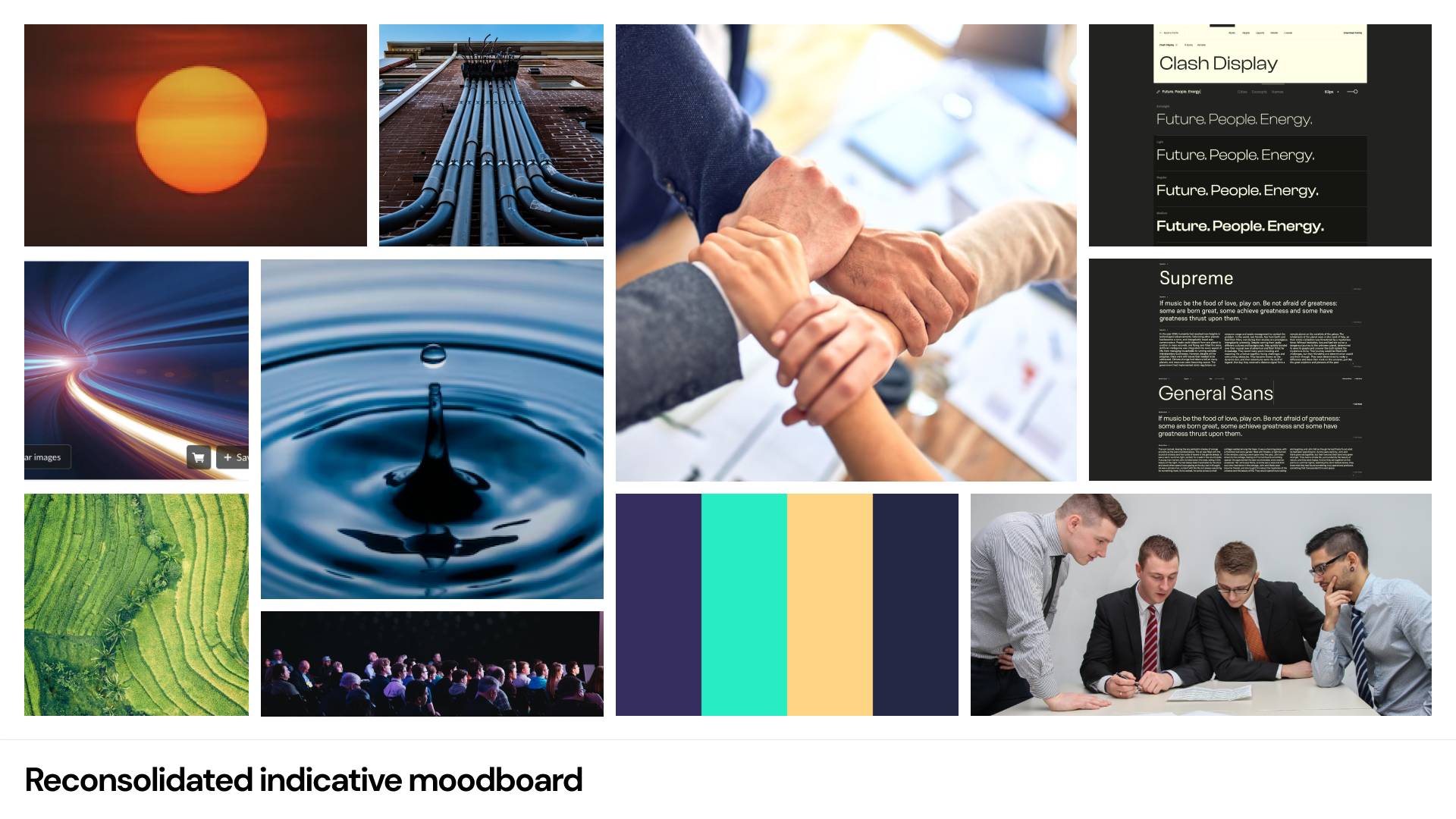
Competitor analysis suggests bold colours with emphasis on iconography as the more successful impression. Supplementary images portraying energy products / "portfolio", the stakeholders' relations, and environmental stewardship ~ were also considered.
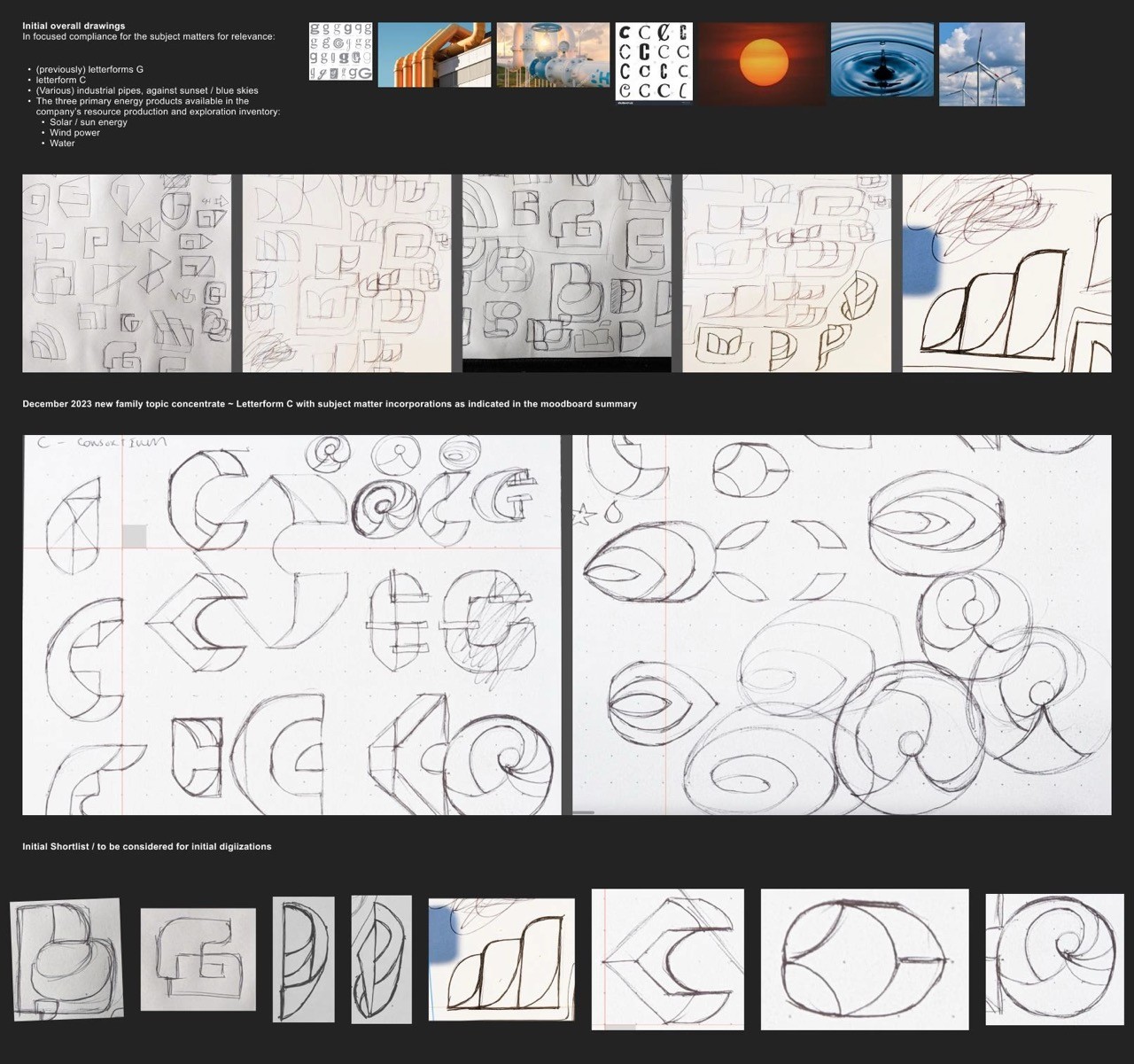
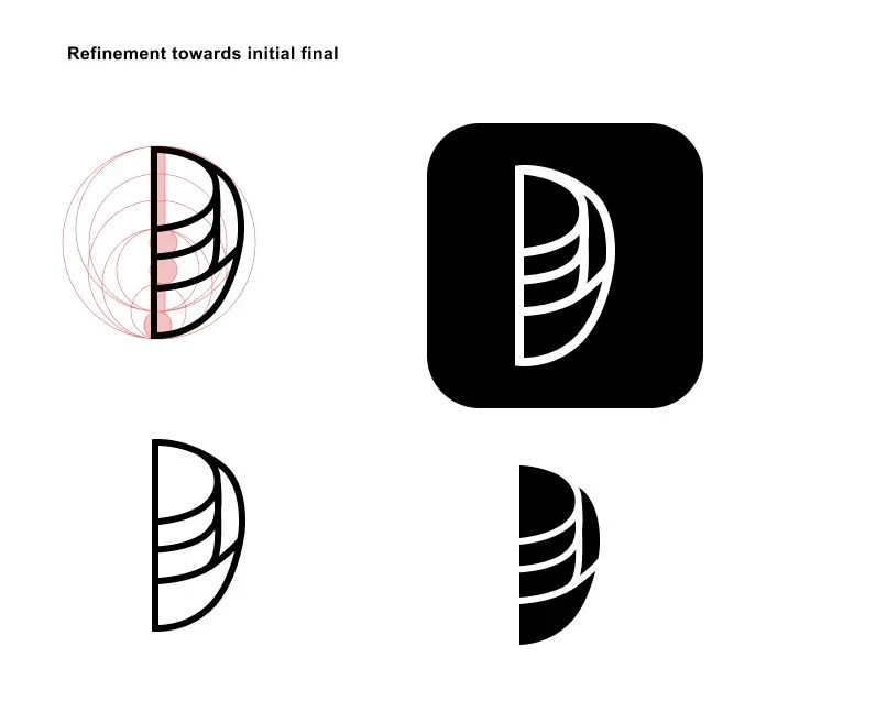
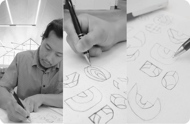
Soon afterwards began the initial sketches prior to digitisation processes, alongside typography brainstorm+pairing.

SWIPE
The Branding Development
Objects representing the company's line of products, alongside themes on corporate responsibility (known as "ESG") were considered.
Later also - on subjects of flora and fauna. Chiefly - the water "droplet", "rays" of the sun light / light spectrum, followed by curvatures of engineered machinations.
Colour theming wise ~ specific turquoise and earthy tone(s) were considered to correlate with.pledges towards serene servitude towards environmentalism, but with contrast in mind.


SWIPE


SWIPE
About this Case Study
Unless otherwise explicitly specified - all artworks, including naming, titling, sample content-writing including this Case study, and the entire front-end development ~ have NOT been entirely resorted through Artificial Intelligence, generative tools or LLM-assisted prompting models.
All hours expended on each project was conducted out of limited, personal and voluntary capacity on top of / during full time tenure.