
NDA Recreation
Click here for rationale
Industry
Social Care
Disciplines
Branding | Web UX & UI


Introduction
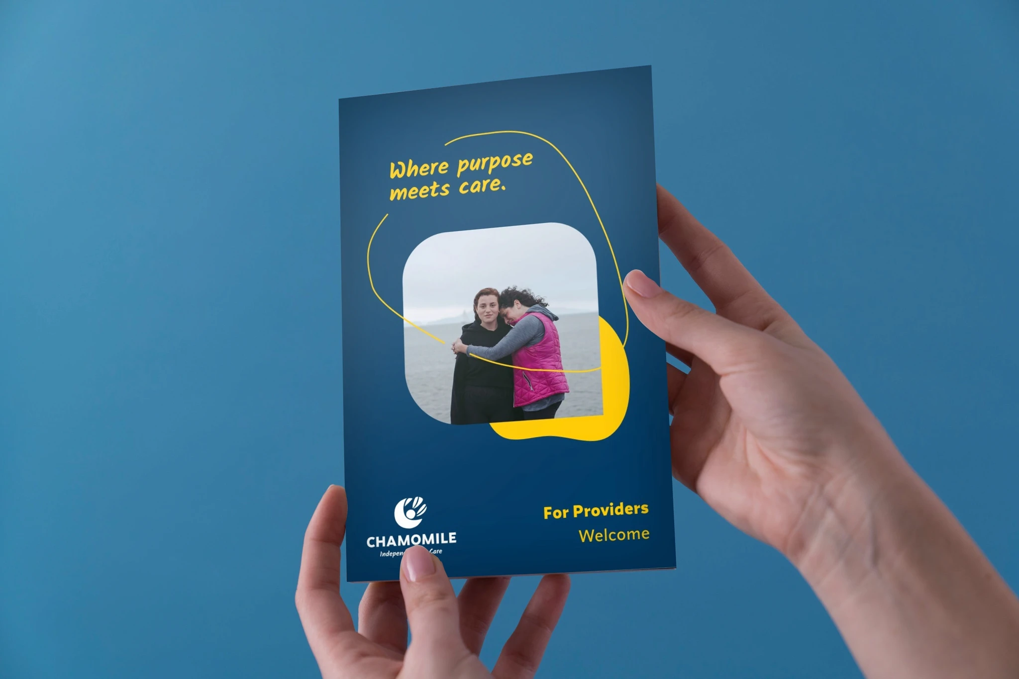
Naming/Titling, Branding and Website design for an independent NDIS (National Disability Insurance Scheme) Provider ~ a network and platform for connecting independent social care providers catering to disadvantaged young adults and teens.
In this first of two part of NDA Re-creation a completely new name, research and ideation was conducted from the ground-up.
During/at the time of industry conduct of the brief ~ front-end development phase (for a basic funnel marketing site) was exercised on select key pages in Webflow®. However out of undisclosed reasons, hosting was discontinued.
Deliverables:
Branding Identity, Moodboarding and Stylescaping
Titling & Naming ~ research & proposal.
In (Part Two) of this NDA Recreation - website design and front-end partial demonstration build in Framer®.
Note: stock images used (Stocksy®) strictly intended only as Creative Direction on photographic composition, styling and subject matter selection.
Problem Statement
An NDIS provider start-up requested a business name, branding identity as well as website connecting independent care providers and clients through one (1) platform. The brand needs to reflect as the connecting bridge between service Providers (independent social carer/s) and their Clients/Customers among young adults in need for social counselling either remotely or by enrolment on activities available within their nearest local businesses and community centres.
Please note that the final chosen name "Chamomile.Me" remains highly subjective in their availability both as domain and/or business name.

Solution
The herbal flower Chamomile was proposed to indicate friendliness and melancholy. In part two of this NDA-Recreation ~ high fidelity visualization, information architecture, and front-end prototype build for the Marketing / Thought-leadership Funnel website in Framer® are demonstrated (for buy-in) ~ a modern, practical and sustainable multi-disciplinary solution.
Demographics
The Demographics here is split into two ~ the Carers / service providers, and the Customers / end clientele.
(The service providers) Independent / existing social workers and/or those in the health care, possibly nursing but non-clinical.
(The client / end customers) young to late teenagers aged between 14 to 21 years disadvantaged from either social or health / neurodiverse in need of social care, and re-transition towards general, life and communication skills.


SWIPE
Mrs. Angela White
(Carer Service Provider Persona)
45 years
Perth, Western Australia
Social Care worker (formerly clinical nurse)
Introvert
Extrovert
Analytical
Creative
Busy
Time Rich
Messy
Organized
Independent
Team Player
Safe
Risky
Background
Carer / Provider Persona
Angela is a 45 year old mother of two whose lifestyle have been adversely affected by the cost-of-living crisis nationwide.
Graduated with a Bachelors and Honours in both Medicine and Nursing, Angela firstly accrued several years of clinical care background before accumulating experience(s) in the remote social care setting.
Described by her peers as approachable and forgiving yet firm ~ she believes every person has dignity worth reconciling, without stigma or prejudice.
She dislikes bureaucracies and paperwork in and out of the social care and nursing industries ~ experiences she no doubt recalls dispassionately from former years.
With recent challenges compounding financial hardships nationwide due to inflation and cost of living, she seeks additional means of income by registering herself as an independent professional in social care, in the hope of building equitable relations directly with her clients within flexible work arrangements.
Industry & Interests
Needs & Goals
Motivations
Pain Points & Frustrations
Naming & Titling ~ Overview
Initial brainstorming was conducted with a goal at finding a name that rhymes appropriately towards friendliness and approachability.
Influences amongst household brand names reflecting a person's name ~ eg. “Sara Lee”, “Arnotts” “Lorna Jane” were considered during early brainstorming as they're widely thought to be relatable among the receiving-end of demographic.
Thus an initial shortlist were firstly raised as follows:
“Annie”,
“Clarissa”,
“Rosa.care”,
“Candice”,


Second generation of concepts
However upon later consideration, a need for second exploration necessitated out of two reasons. Firstly ~ the initial options did not seem to capture the gender agnostic needs of the customer base as many of these did sounded effeminate. Secondly ~ the likelihood that these names are no longer vacant were quite high.
Alternatives therefore, were sought. Leading to another shortlist as follows.
Hello.Bubble
Chamomile
Ruby & Spring
Lavender.care
Hello.Connect
Care.Spot
Choice.Connect
From the above ~ “Chamomile” stood out eventually for serene, re-assuring and melancholic connotations. With ".me" domain extension to express a personalised touch.
Research and Stylescaping
Common subject matters amidst competitor profiling suggests high reliance on clouds, blue skies, and the outdoors; understandably for conveying freedom, independence, and autonomy.
A few notable ones however resorted to highly tailored proprietary illustrations.
For lean, timely and pragmatic delivery of this NDA Recreated brand whilst staying competitive ~ a more conventional approach between carefully chosen stock photography and combined with brand-artifacting were considered.
Thus compilation of visual assets were carefully gathered in place to suggest ~ the overall brand pallette as Style Scape; illustrating the brand's elements and visual essences, all at-a-glance.


Brandmark development
The first intrigue and highly conceptual development was surrounding the hand-lettering concept of the brand title chamomile. However it was decidedly not pursued to completion; due to its effeminate reception.
Alternatively, conventional explorations on all elements and characteristics of the chamomile alongside key other subject matter(s) were conducted. These were then further digitized and examined into more realized vector forms. Eventually synergising together:
(The letterform C) representing Chamomile's brand initial,
The organic leaves of the flower and, lastly;
A sillouhette youth; reaching out for the sky and embracing it.
The Typography
Upon the list of options (as shown here) ~ the industrially-inspired sans-serif Synonym was chosen to be paired with the handwriting analogue Kalam. The latter was encouraged to only be used judiciously. Altogether these aim to promote and (though not overly embellishing, hence the rationale for a slightly industrial Synonym) to convey autonomy within the individuals, that being the clients ~ rather than belittling or overly-patronising them - of their circumstance with excessively rounded letterforms.


SWIPE


SWIPE
Post Project Outcome / Criteria
I humbly disclose that at the time of industry conduct ~ any or all impact statements were strictly forbidden for me to query and/or simply unobtainable. The following criteria below are what I would raise soon after a Project surpasses their service period; as hypothetical “Retrospective” .

About this Case Study
Unless otherwise explicitly specified - all artworks, including naming, titling, sample content-writing including this Case study, and the entire front-end development ~ have NOT been entirely resorted through Artificial Intelligence, or generative tools.
All hours expended on each NDA re-creation(s) were conducted out of limited, personal and voluntary capacity on top of / during full time tenure.