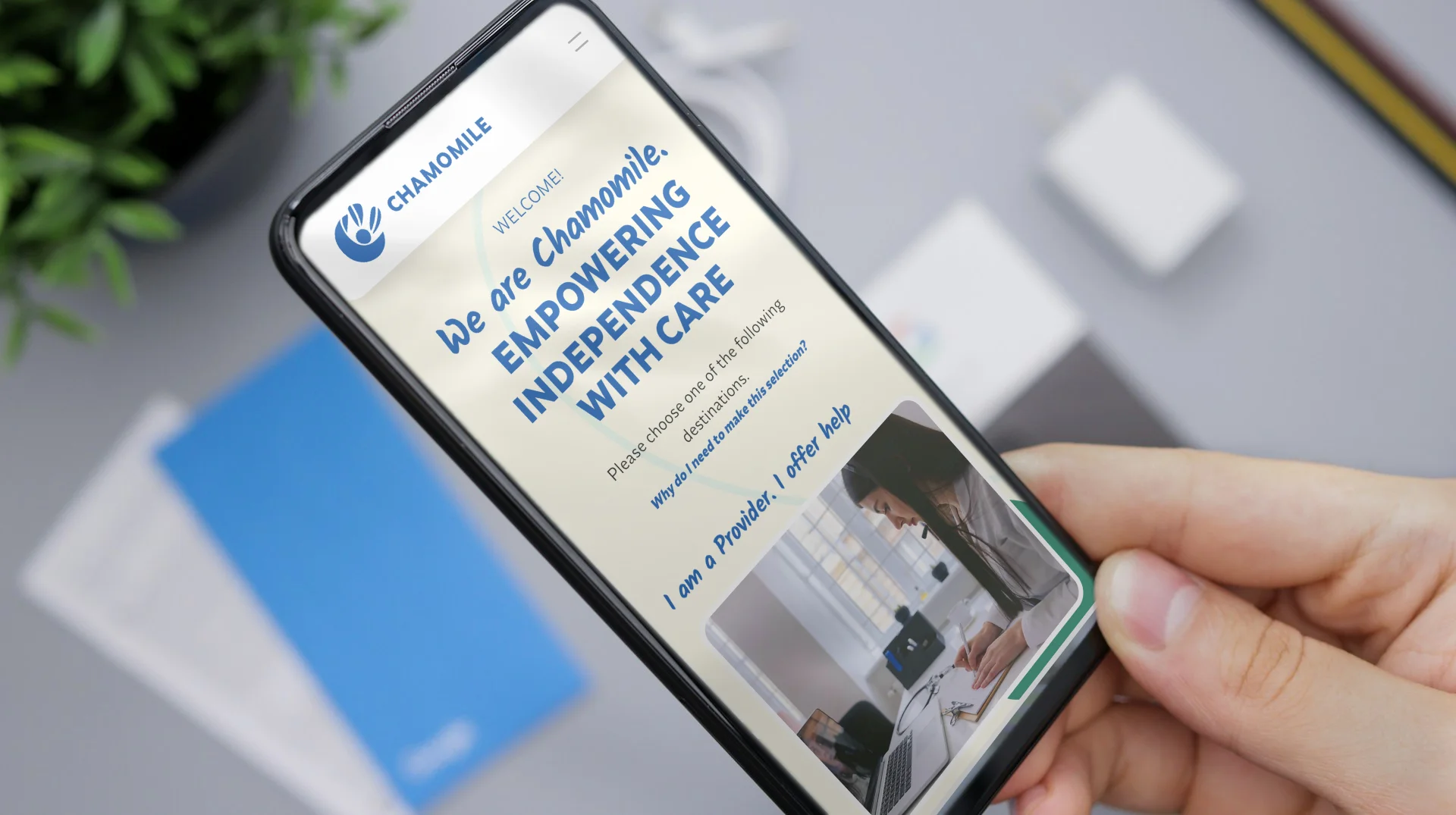
Introduction
Backed by the Australian Government NDIS scheme, Chamomile.me is a professional platform for independent carers/providers servicing the needs of disadvantaged young Australians through remote counselling.
Following from Part 1 (the Branding), high-fidelity digital visuals, and development trial(s) firstly in Ycode® before then in Framer® to promote knowledge base / thought-leadership and feature incentives for joining the platform.
As this is a fictionalised re-work based on actual brief ~ Impact statements are not available. However, a series of retrospective criteria(s) are presented (at the end of this study) to pre-empt post-project or post-service industry expectations.
Problem Statement
Chamomile.me requests a marketing digital presence to promote its match-making services to connect clients and providers all in one place in a form of Dashboard administrative app. The website aims to promote and communicate the incentive(s) for joining the platform between the two (2) primary audiences ~ the Clients and Service Providers.
Not included at the time of actual industry conduct, were the following :
The full featured administrative Dashboarding project tailored for the two (2) audiences.
Content governance, content planning and writings. All content writings here were instead manually re-derived and re-phrased for on-brand personalisation. As well -for indicating the ideal typographic texturing.
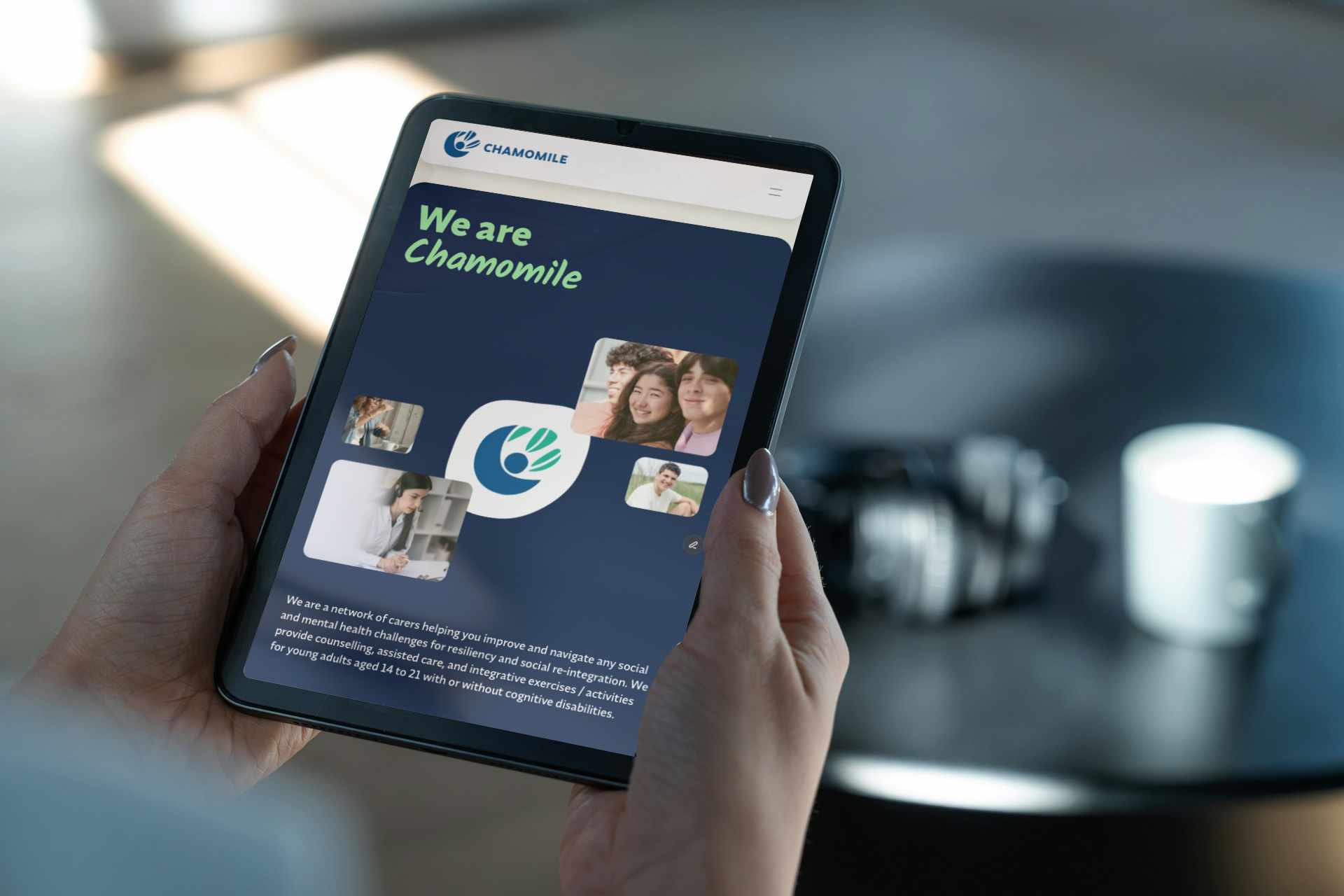
Deliverables
Sample UX research diligences from customer mapping to functional blueprinting, before then high fidelity visualizations, trial front-end development in Ycode® (2024) before then manual re-translation into Framer® (2025) to modernise the user experience. For timely and practical delivery of this Case Study - only a select few key pages, alongside basic CMS functionality with indicative (re-adapted) content writings are demonstrated.
Demographics
(The service providers) Independent / existing social workers and/or those in the health care, possibly nursing but non-clinical or terminal.
(The client / customers) teenagers to young adults aged between 14 to 21 years disadvantaged from a recognised mental or health disability, neurodiversity-challenged, or in need for general social counselling through support integrative (activity participations) activities with local businesses nearest to their proximity.






SWIPE
Mrs. Angela White
Archetype ~ “Multi-tasker”
45 years
Perth, Western Australia
Social Care worker (formerly clinical nurse)
Introvert
Extrovert
Analytical
Creative
Busy
Time Rich
Messy
Organized
Independent
Team Player
Safe
Risky
Background
Carer / Provider Persona
Angela is a 45 year old mother of two whose lifestyle have been adversely affected by the cost-of-living crisis nationwide.
Graduated with a Bachelors and Honours in both Medicine and Nursing, Angela firstly accrued several years of clinical care background before accumulating experience(s) in the remote social care setting.
Described by her peers as approachable and forgiving yet firm ~ she believes every person has dignity worth reconciling, without stigma or prejudice.
She dislikes bureaucracies and paperwork in and out of the social care and nursing industries ~ experiences she no doubt recalls dispassionately from former years.
With recent challenges compounding financial hardships nationwide due to inflation and cost of living, she seeks additional means of income by registering herself as an independent professional in social care, in the hope of building equitable relations directly with her clients within flexible work arrangements.
Industry & Interests
Needs & Goals
Motivations
Pain Points & Frustrations
The Branding Alignment Chart & The Journey Map
This reveals the user’s current emotional alignments with common brands. Reddit, Facebook, Glassdoors, LinkedIn to name a few; rating them as portrayed and/or expressed by - the community, their impressions, experiences and interactions with each brand's ecosystem ~ altogether as brand sentiments.
The Journey Map narrates a sample, as the Provider persona shown here as example ~ transition from Discovery to Engagement. Firstly from researching and benchmarking other similar NDIS providers and/or platforms, before then shortlisting to final few to execute initial outreach(s) and service engagement.
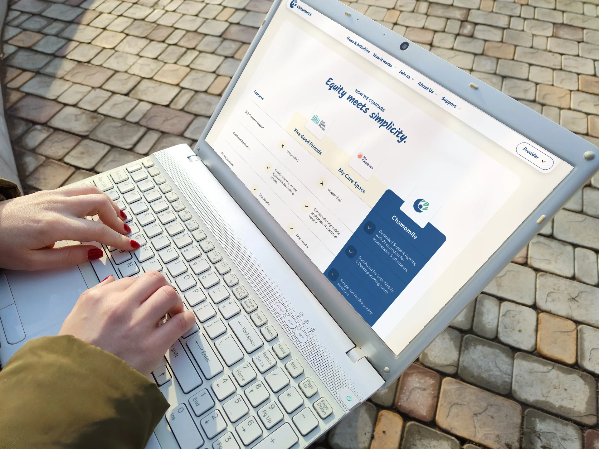
As key extrapolation for the visual design implementations ~ was a Comparative table or likewise matrix comparison chart to help meet benchmarking expectations among discerning visitors.
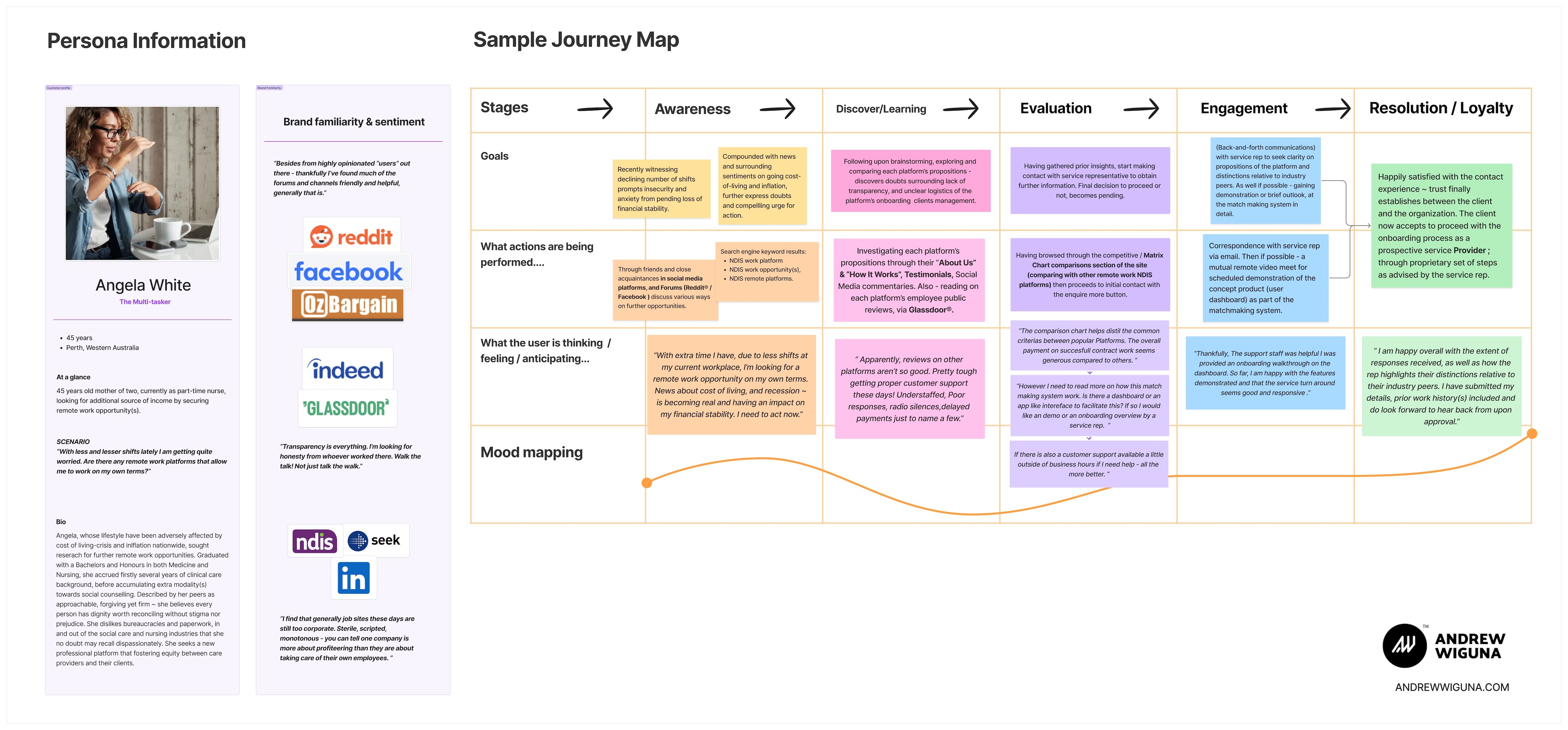
Sample User Journey Map
Information Architecture
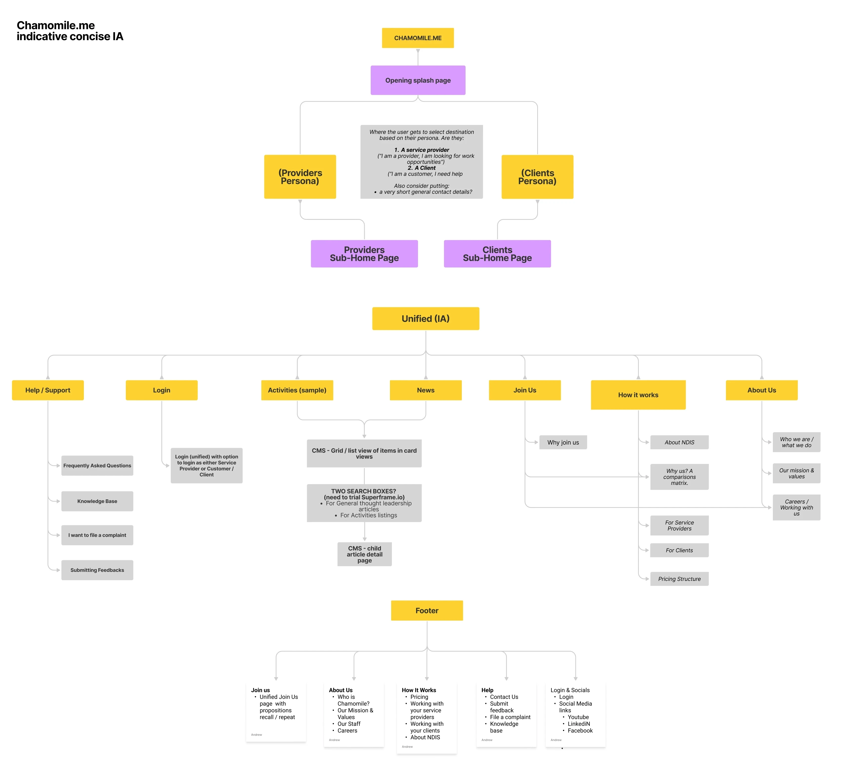
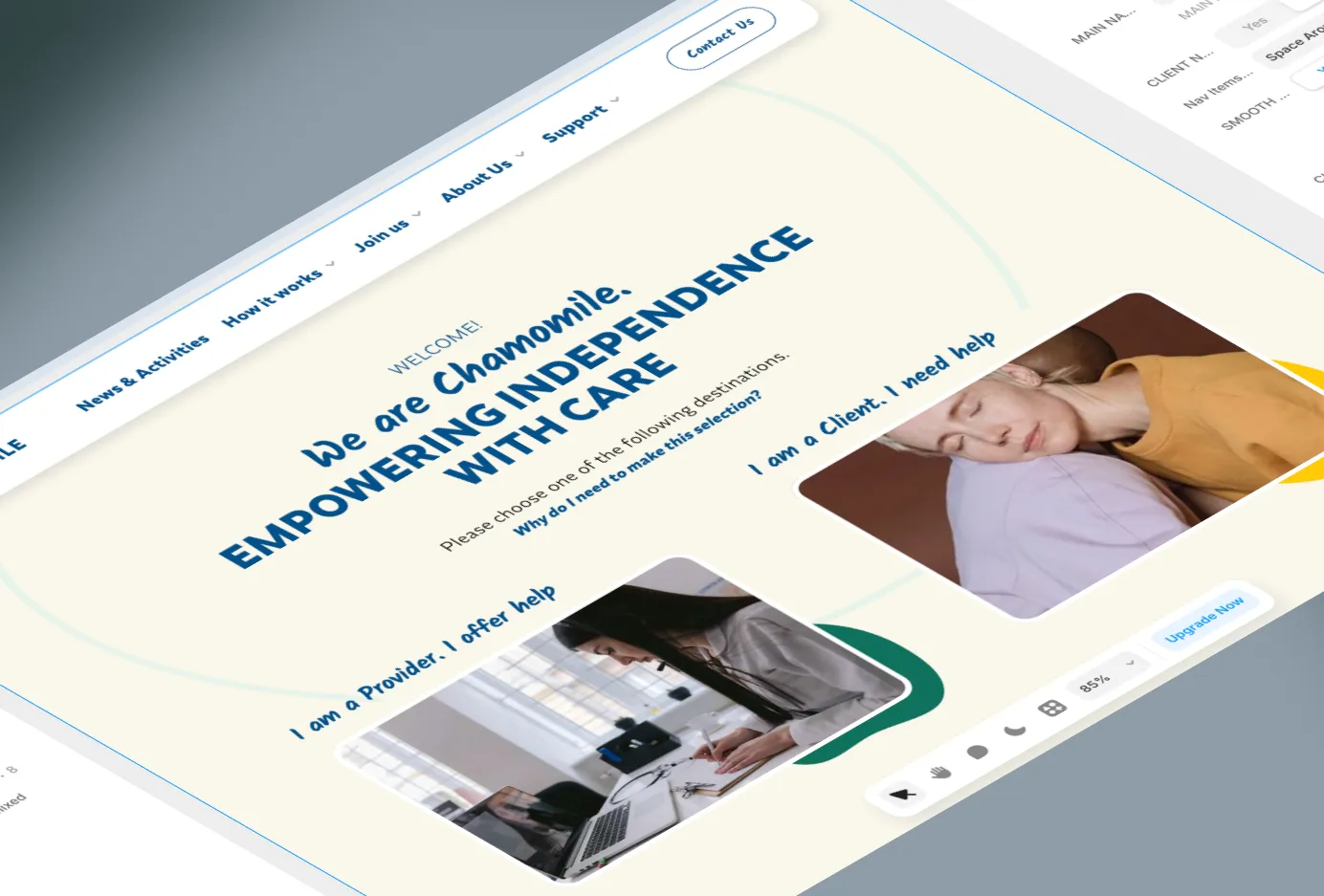
Upon visiting the site for the first time, a "Splash" page here introduces the users two tailored content pathways as either a Clients or a Service Providers. Each leading to their own separate "Sub-home" pages.
Each "Sub-home" page content-writing is tailored to honour the two personas, as expected.
Clients - be provided with contact form for immediate engagement opportunity with the customer service and experience onboarding teams.
Providers - be enlightened, informationally, with incentives and benefits for becoming a Service Provider.
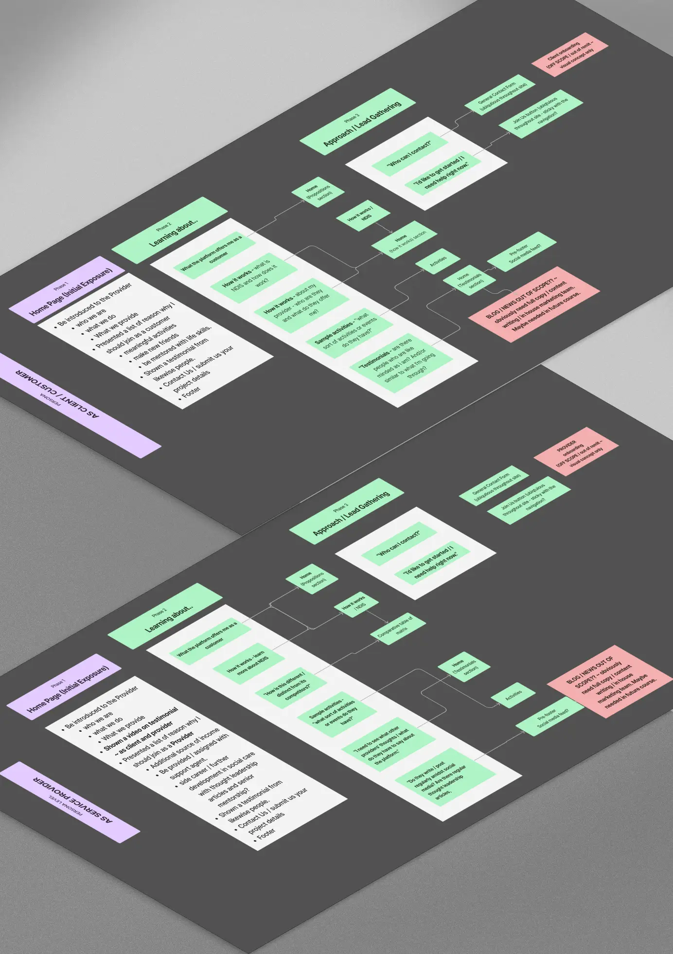
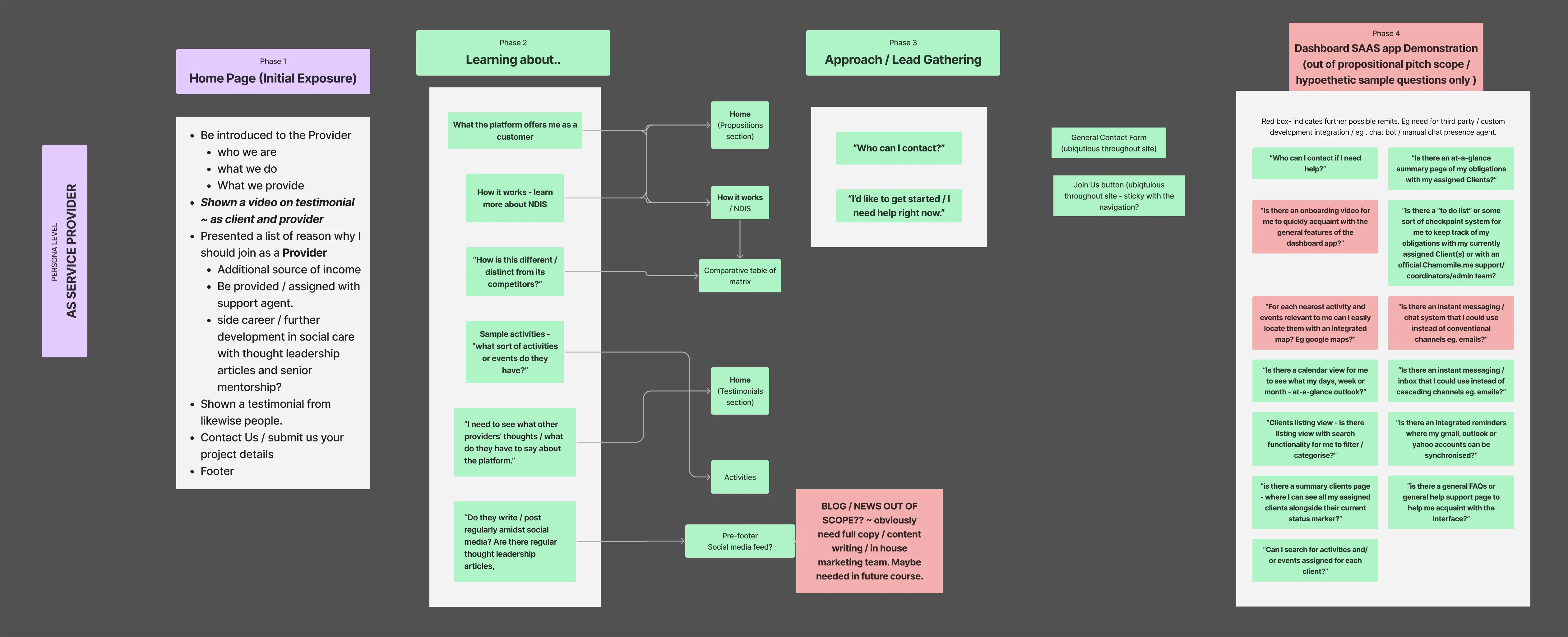
(Sample) UX Planning - Functions / Service blueprint
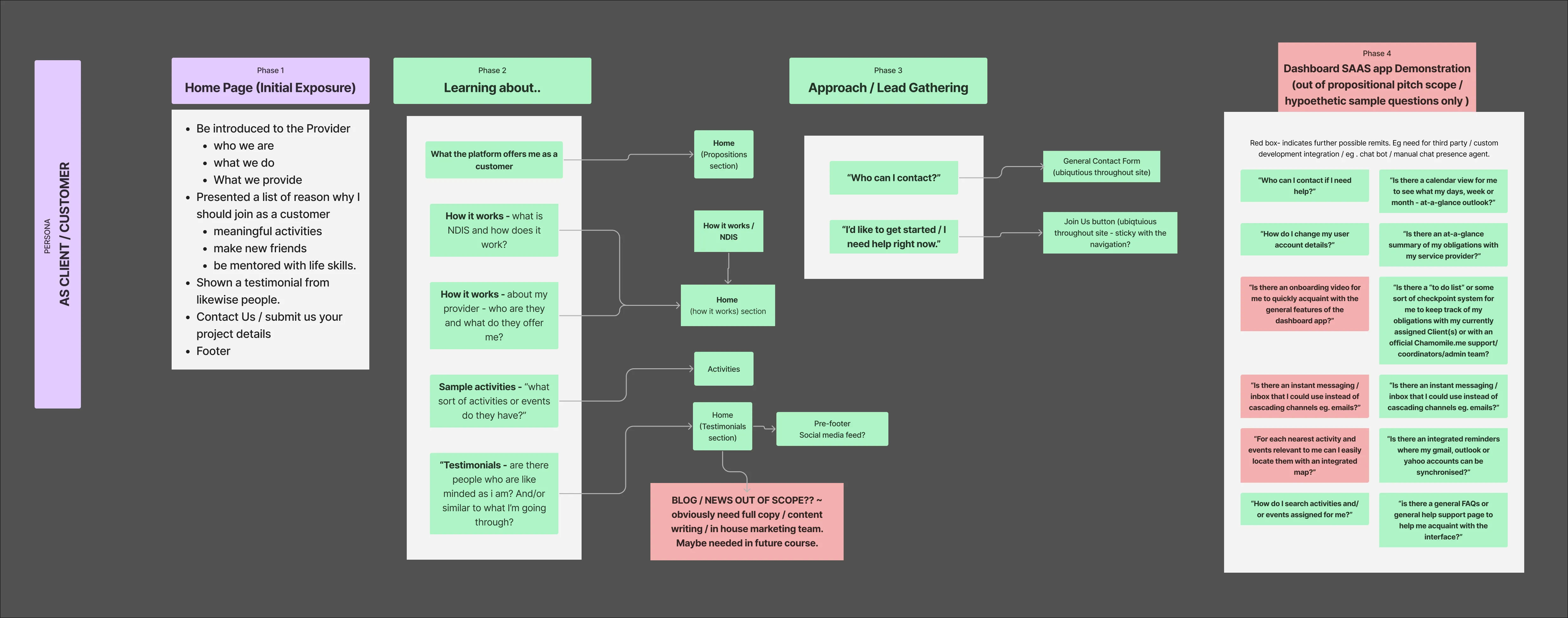
As research incentive known as Service Blueprinting ~ this process involves brainstorming of questions to reveal and to map out various "in" as well as "out" ~ of-scope propositional features of the site development.
For keeping this Case Study deliverables concise, only a few segment of these expectations are shown to succinctly demonstrate the intent behind this obligate UX planning process.
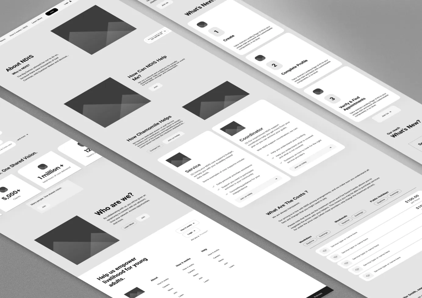
The Design ~ Atomic Design System
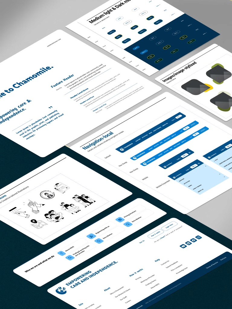
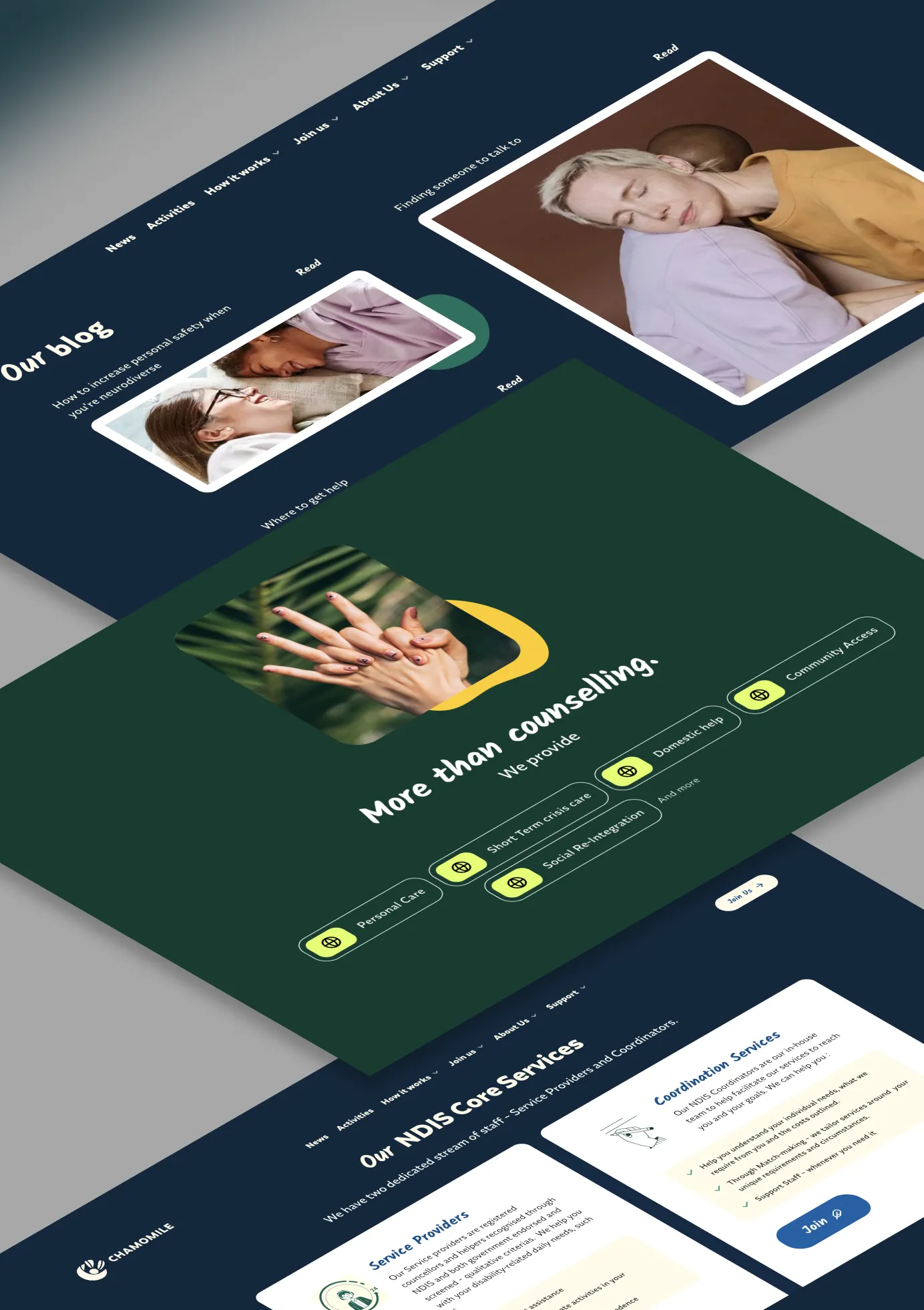
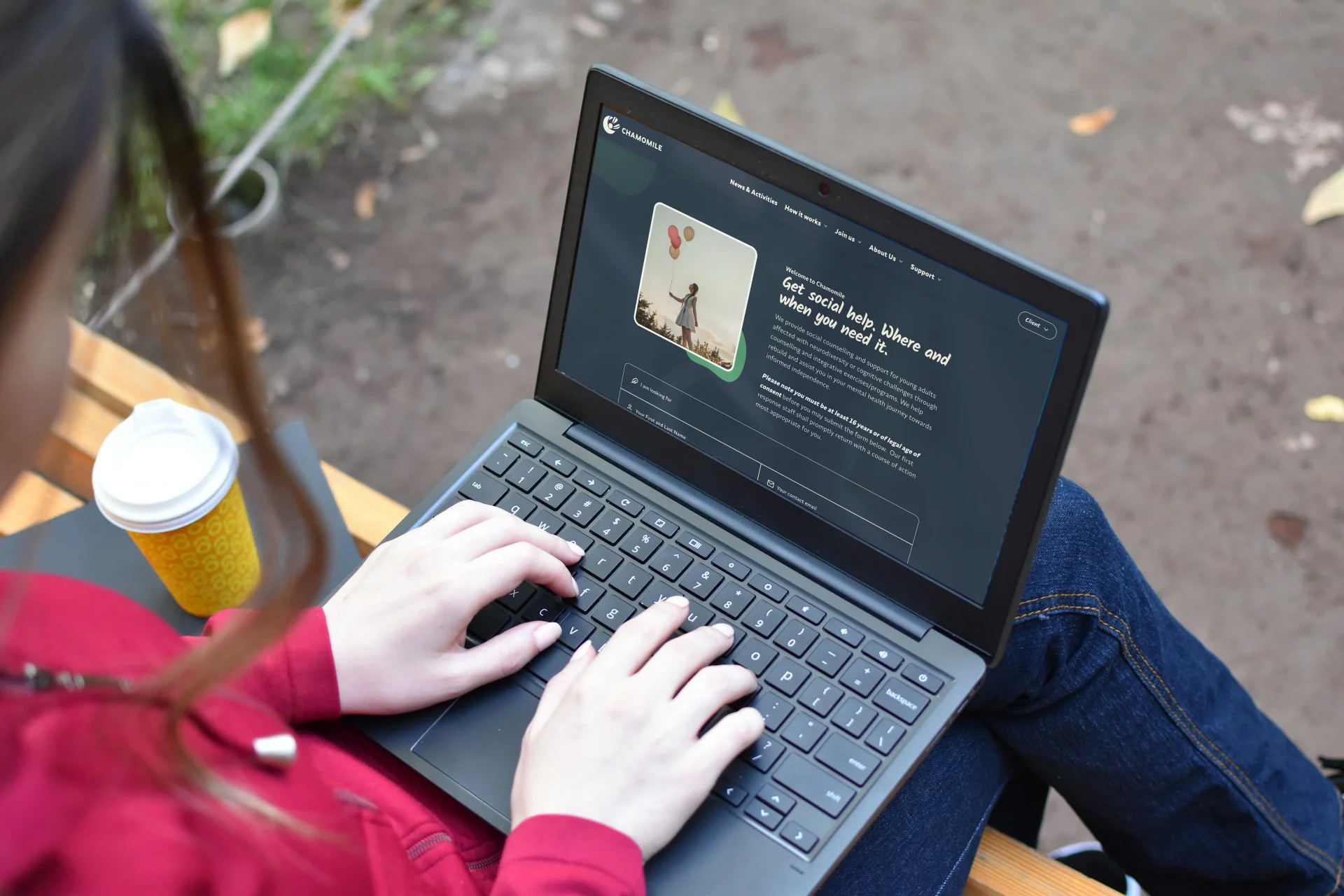
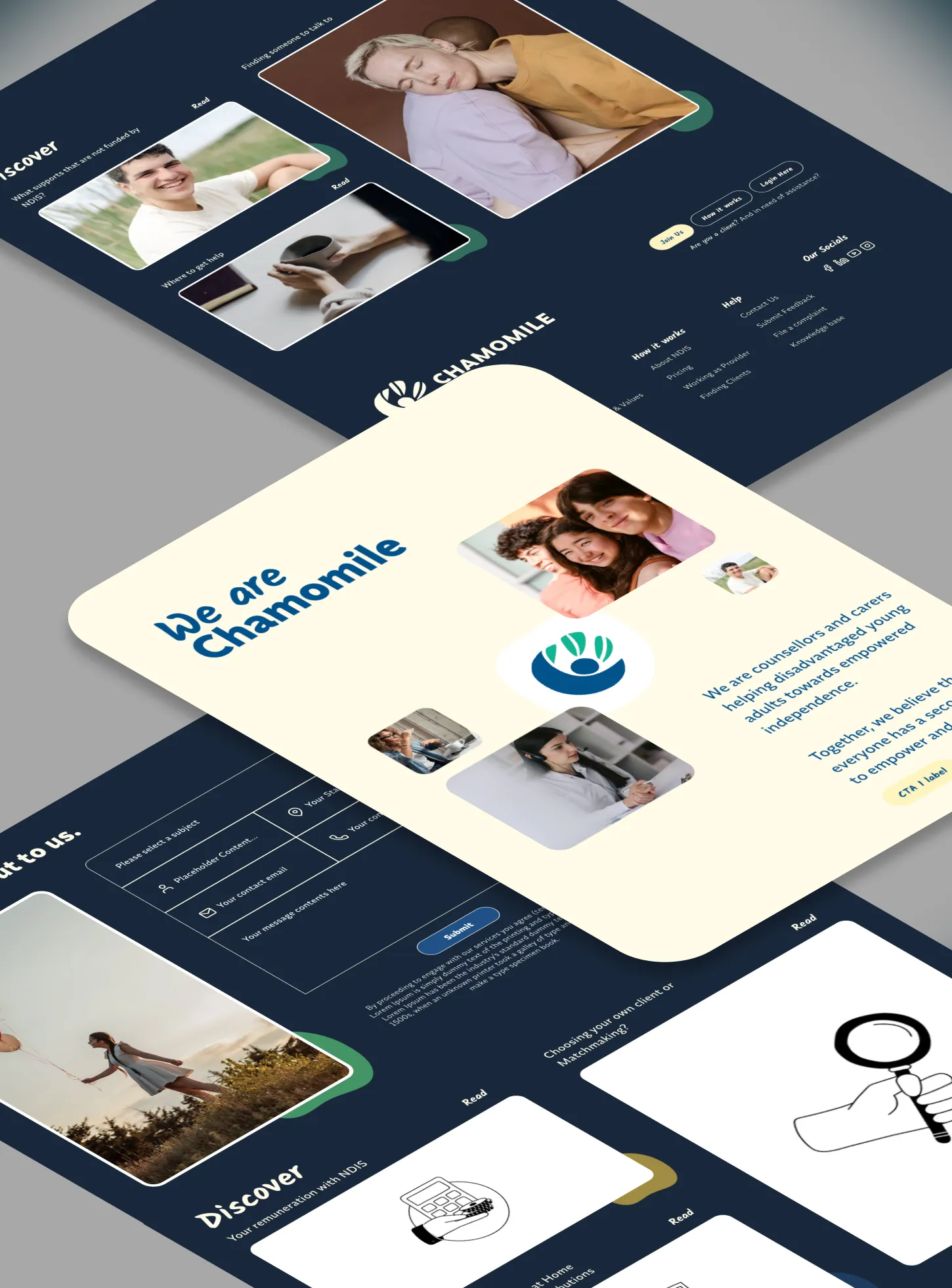
By retailoring existing custom, from-the-ground-up Atomic DS (Design System), a number of visuals capturing just the essential key pages are shown here.
Decorative or overly embellishments artifacting were certainly applied but remain judicious in order to remain concise, and evenly-levelled among its industry peers.
The Build (Ycode®)
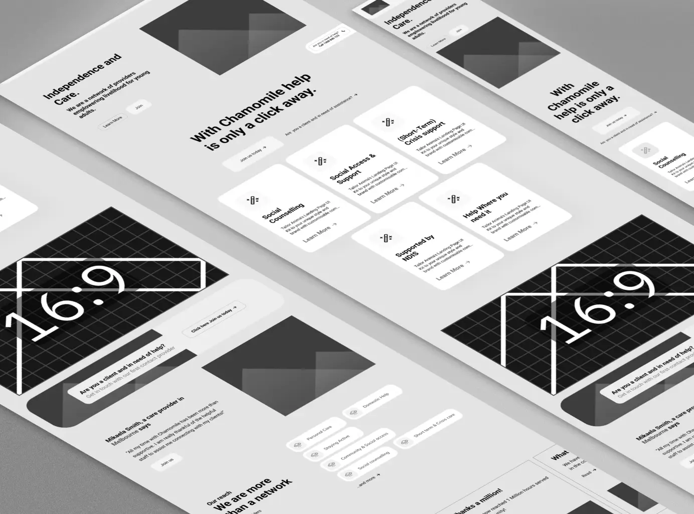
Firstly trial-built in Ycode® on just few key page(s) - a number of significant technical features barriers were experienced.
After a month and half, as part of self-learning initiative in the platform elapsed - a decision was made to transition to the more industry-rigorous and recognised platform - Framer®.
SWIPE
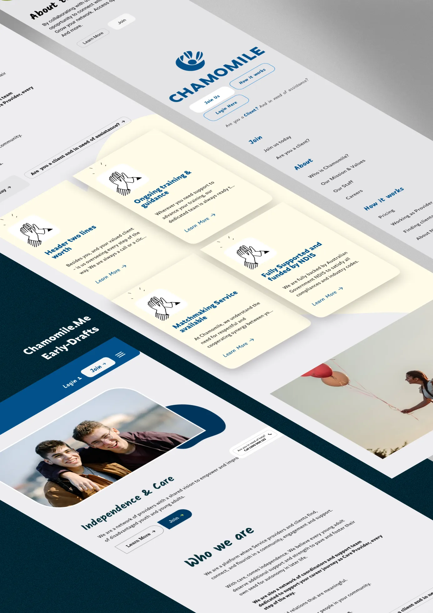
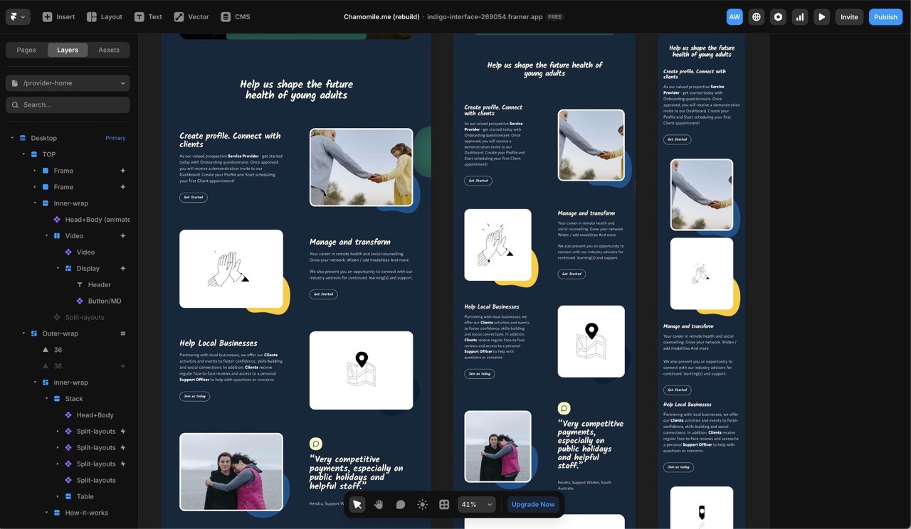
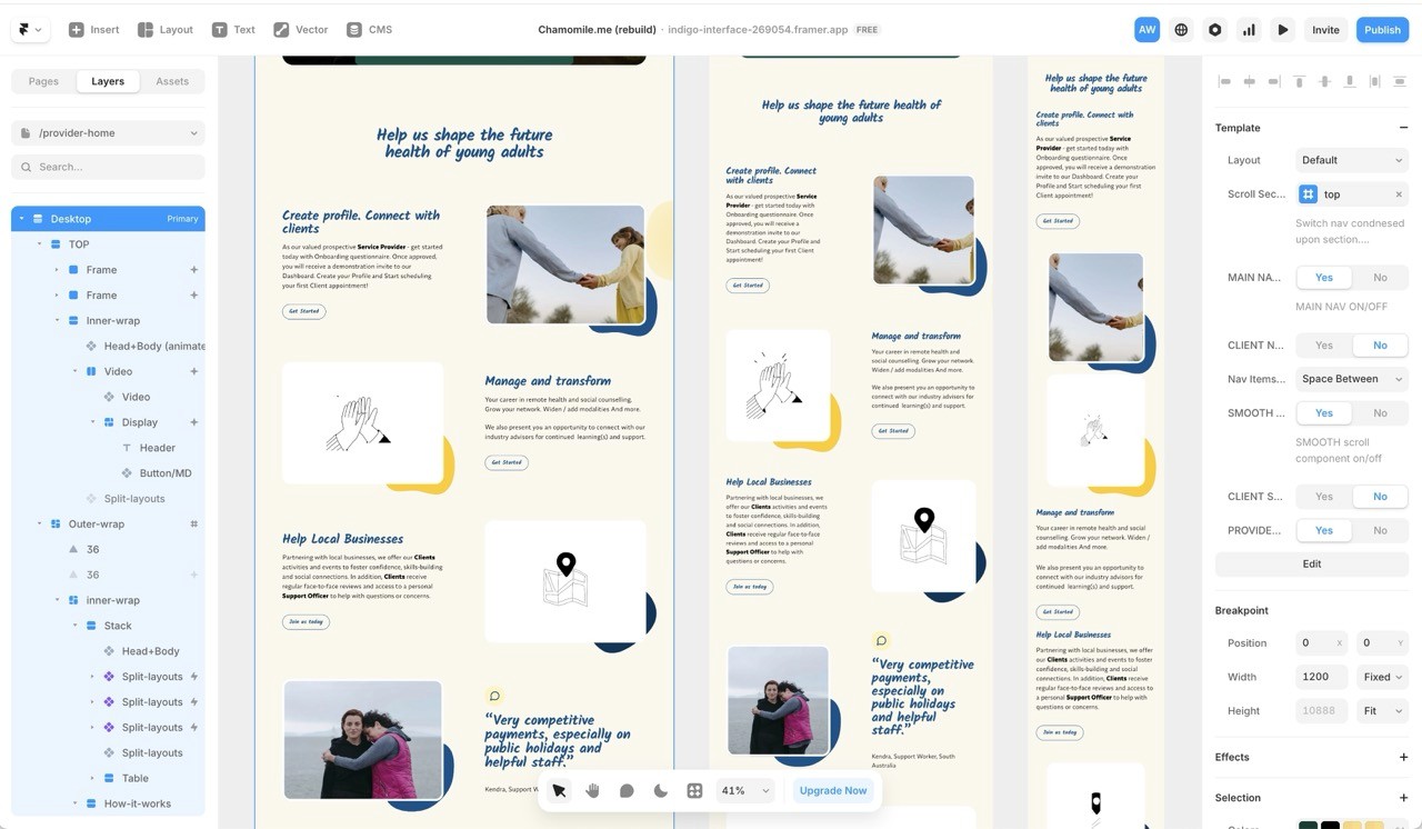
The Second Build (Framer®)
In this new build, a new development design system in Framer were exercised all from the ground-up, with componentizations in place alongside few plugins needed to achieve Filtering system amidst Blog / CMS index pages.
Technical Limitations of this Build
This is only a partial build to demonstrate the no-code knowledge acquisition remits at the time, at least on key pages; within Framer®.
Due to limited time and knowledge-scope at the time of preparing this Case Study - many other conceptual features of the web site, initially conceptualized / proposed from Figma® at the project's beginnings could not be carried out.
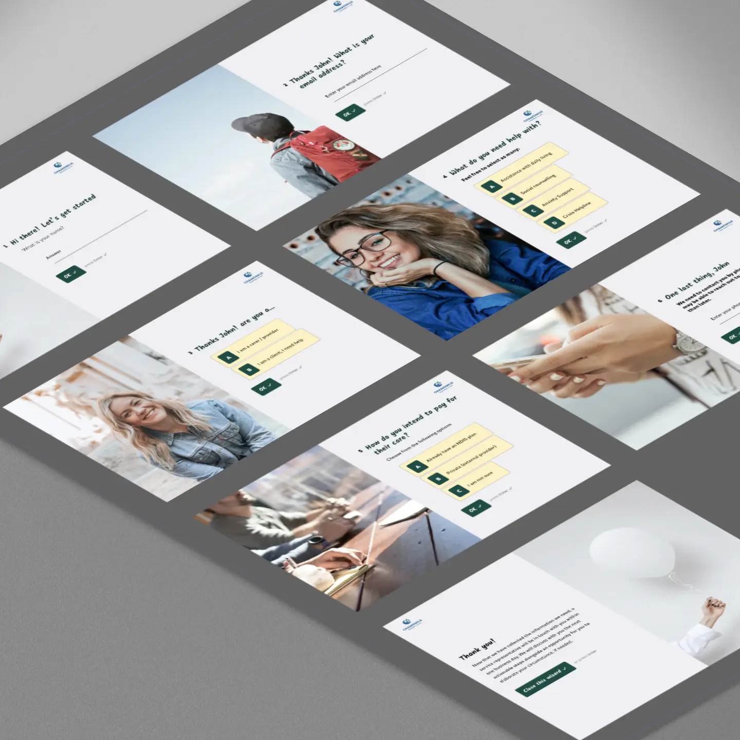
Typeform® ~ with Framer's pre-leading information questionnaire. To onboard prospective user/s (either as Clients or Providers).
The full administrative dashboard for the two persona(s)
At the time of actual industry conduct - this Dashboard component was posited as the next / separate project should the propositional pitch passes satisfaction.

SWIPE
Post Project Outcome / Criteria
I humbly disclose that at the time of industry conduct ~ any or all impact statements were strictly forbidden for me to query and/or simply unobtainable. The following criteria below are what I would raise soon after a Project surpasses their service period; as hypothetical “Retrospective” .
About this Case Study
Unless otherwise explicitly specified - all artworks, including naming, titling, sample content-writing including this Case study, and the entire front-end development ~ have NOT been entirely resorted through Artificial Intelligence, generative tools or LLM-assisted prompting models.
All hours expended on each project was conducted out of limited, personal and voluntary capacity on top of / during full time tenure.